A feature recently introduced in Tableau is animations. While you might think that this is rather a gimmick than truly adding value to your visualisations, please, have a look at this dashboard build from Tableau’s Superstore dataset.
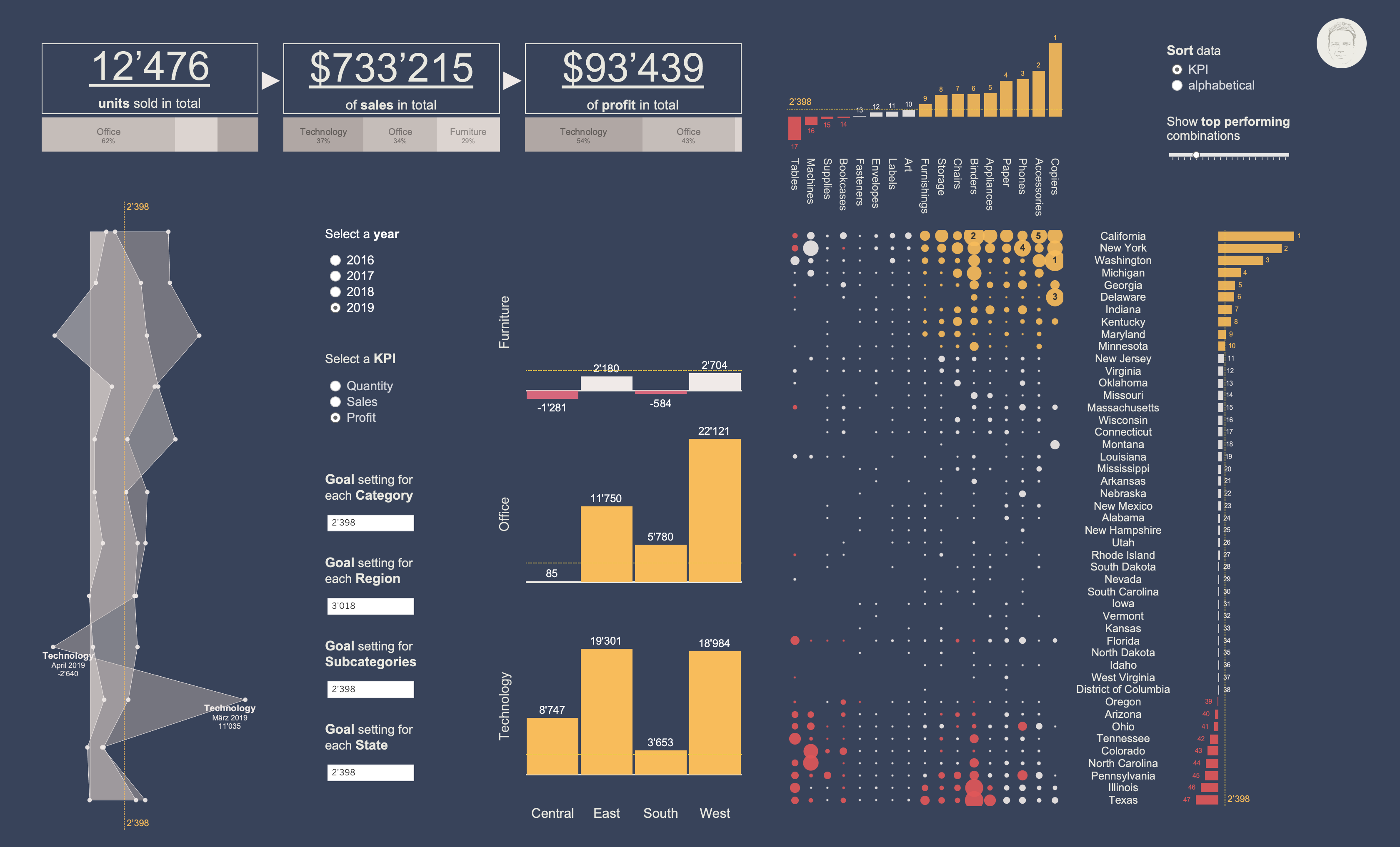
I believe that animations can add a lot of value to many visualisations. A great and well-known example is Hans Rossling’s presentation of how average life expectancy at birth vs. fertility rate changed over time (TED talk from 2007).
Animated visualisations provide a means to ‘feel’ the change in your data. This is especially true for changes in time or space to which we can easily relate to. But it also works for changes in numerical variables like ‘sales’ or ‘profit’. Next time you create a dashboard or static chart, try using animations and see whether they can add some value to it.
A second feature I used here is parameter actions. At first, it doesn’t sound all too exciting. However, it’s the feature that truly boosts your dashboard in terms of interactivity. Instead of changing a parameter value manually (using a slider, typing etc.), you click or hover over specific parts of your visualisations and the parameter value is changed accordingly. This allows for so many cool effects and improves interacting with your dashboard a lot.
I was using parameter actions in combination with reference lines. That is, when hovering over a specific part of a visualisation or clicking on it, the parameter value is adjusted to the value of the part you interacted with. This is so much more satisfying when exploring a dataset…