In this project I analysed and visualised storms belonging to the revised Atlantic hurricane database (HURDAT2). I did this to practice of R Shiny and Leaflet for R, which both are wonderful tools to communicate information.
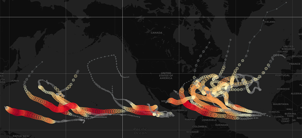
Before any analysis, one has to get an idea about the data. That is, what is the format, how is it structured, are there any gaps popping up, can one spot misspellings or odd entries and so on. But most important, one has to have at least a basic idea about what to do with the data set. There can always be new insights and paths to follow. However, without any initial question(s) it is hard to find the motivation working with a specific data set. My initial questions for the storms data set were:
- How many storms reaching the category ‘hurricane’/’typhoon’ occur in the Atlantic and Pacific oceans?
- How strong are they?
- Is there a pattern with respect to where storms arise and disappear again? What does it look like?
- What were the strongest storms ever recorded and where did they appear?
These are rather simple questions and the dataset should be able to answer them. But before diving into the numbers the data set has to be prepared for analysis. I describe the way that I have done this here.