Dogs of Zurich is a dashboard that provides an overview of the dog types registered in the city of Zurich (CH). You can have a look at this dashboard on Tableau Public, or watch a video on Vimeo.
Why this dashboard…?
Do I have a particular interest in dogs? Nope, definitely not. Rather, I wanted to check out two features in Tableau:
- synchronous scrolling of two or more tables, and
- switching containers on/off to show/hide content
I came across the dog dataset earlier when looking for data on Open Data Zurich, an open data catalogue containing freely accessible data from the city of Zurich. There’s a lot of interesting data to find there… I chose the dog dataset because it’s small and not used very often. But you can find an outdated version on Kaggle, too.
What’s its scope?
Because every visualisation needs to be designed to answer specific questions, I came up with the following:
- How many dogs are there in Zurich?
- Which dog types are most common?
- Are there any preferences by a dog owner’s gender or age?
These are three questions one can easily build a dashboard around.
What’s the content?
First, I decided that the dashboard should have two parts: a cover that provides a quick overview of the main facts (How many dogs? How many types? How many owners?), and, the actual dashboard which contains more detailed information and allows for a higher degree of interactivity. These parts are connected by both a navigation button in the lower right corner and the globally acting parameter values.
Part I: cover
I call it ‘cover’, but it could just as well be called ‘overview’ or ‘intro’. To me, it serves as a cover for the actual dashboard. Therefore, it does show the main facts, but lacks the detail and interactivity provided by the actual dashboard.
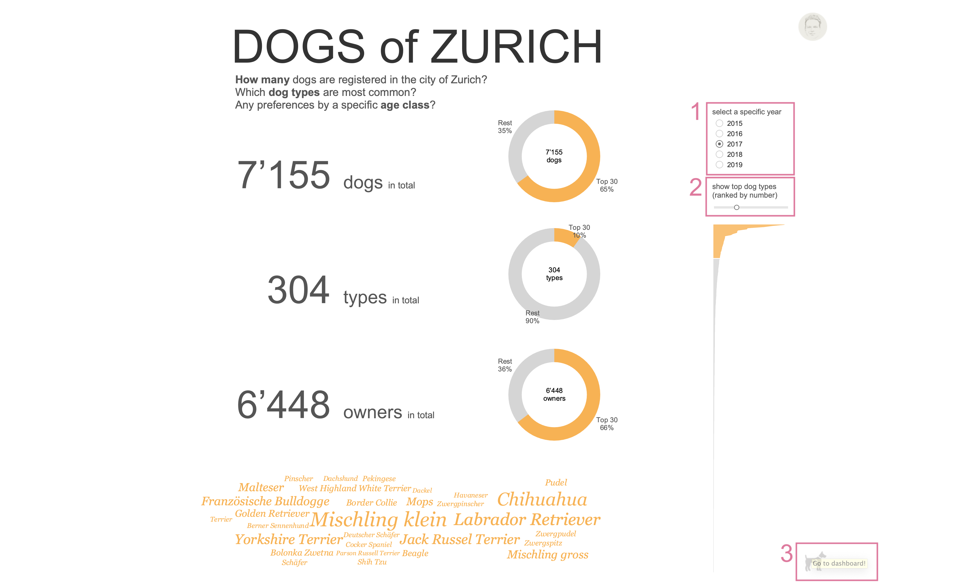
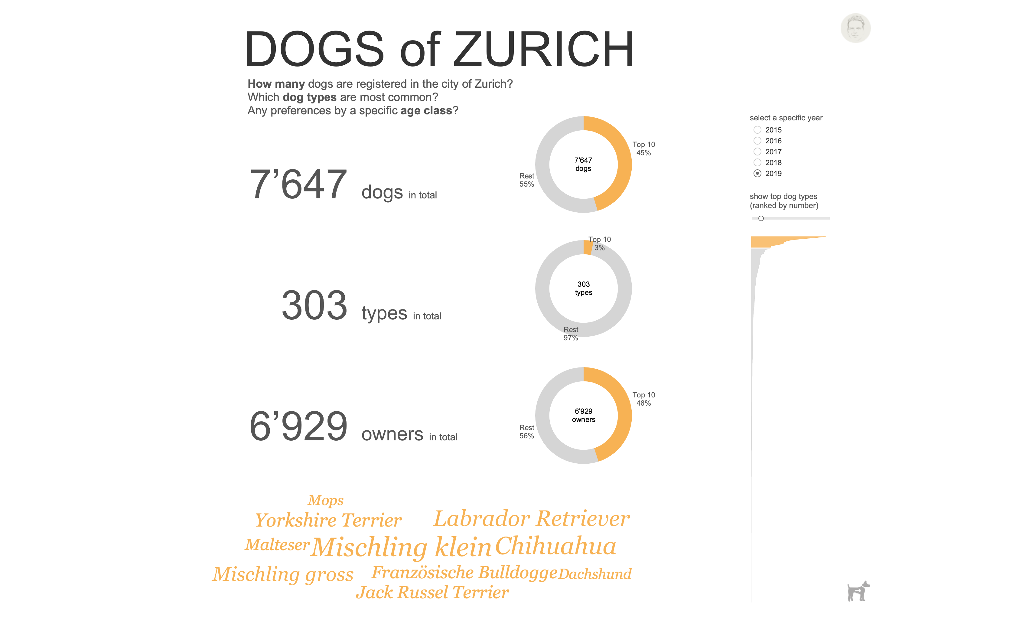
Three big numbers form the main part of the cover, providing the answers to the questions stated in the previous paragraph. Next to these, one can see three donut charts displaying the contribution of the top n dog types to the respective variables (# dogs, # types, # owners). I really appreciate the Pareto approach here. When looking for the most common dog types I’m also interested in how much these contribute to total numbers. For example, in 2017 the top 30 types (10% of all types) made 65% of all dogs in Zurich. I consider this really helpful to get a good idea of this dataset. Year (1) and top n (2) parameters can be set in the upper right part of the cover. They act globally for both cover and dashboard. To get to the actual dashboard, you can click on the navigation button (3) in the lower right corner.
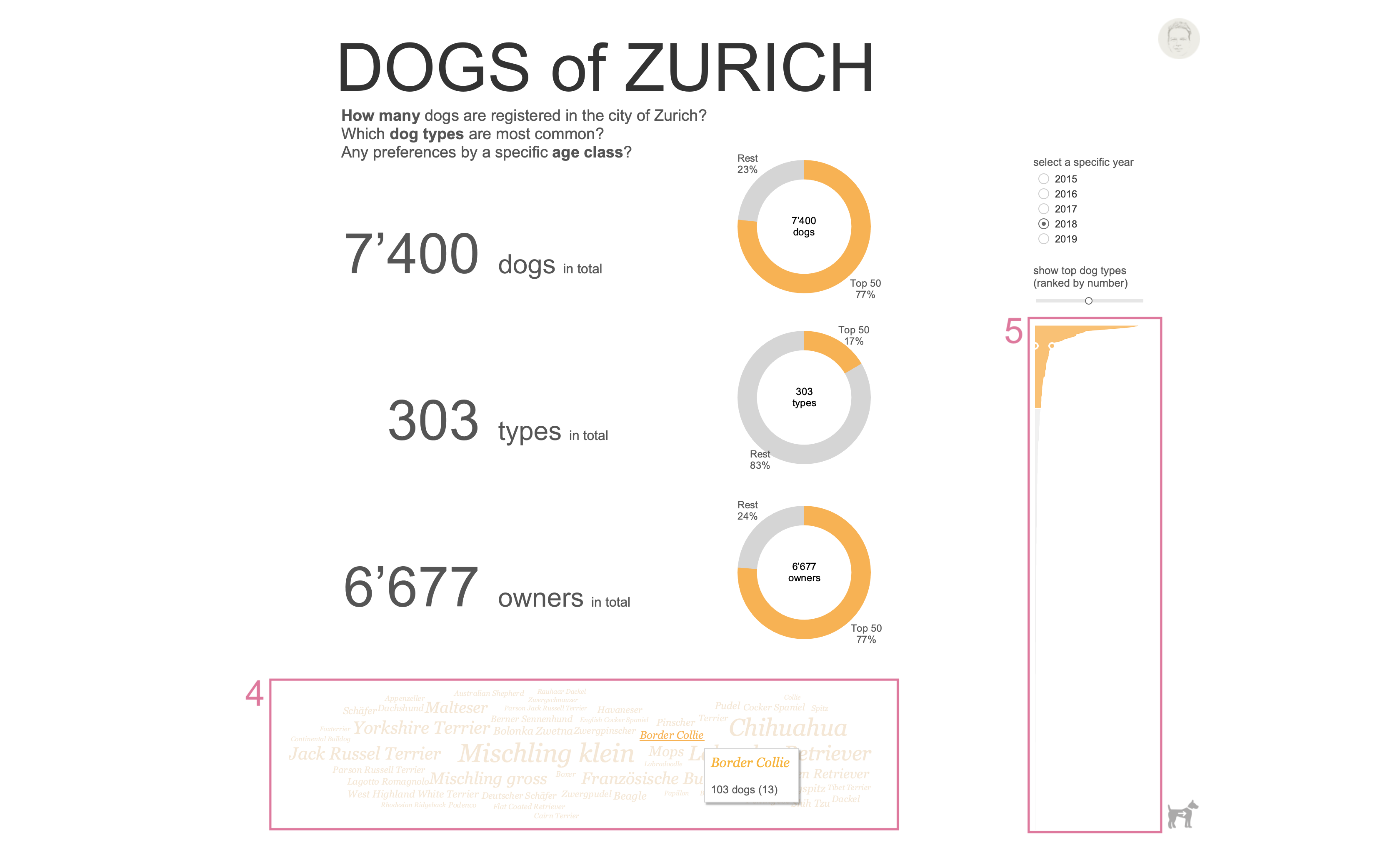
At the bottom of the cover I included a wordcloud (4) to see the actual dog types. When hovering over the type names, a tooltip appears revealing the total number of dogs belonging to this type and the respective rank in parentheses. In addition, when clicking on a type a link is provided to the respective site on Wikipedia.de. Please, be aware that this link will guide you to the German Wikipedia page! This is due to the fact that the names of all dog types are in German. It would have been too much of an effort to translate them into English. Sorry…!
Finally, I included a super simple area chart (5) to display how many dogs belong to which dog type. The respective dog type gets highlighted here when hovering over the wordcloud.
Part II: dashboard
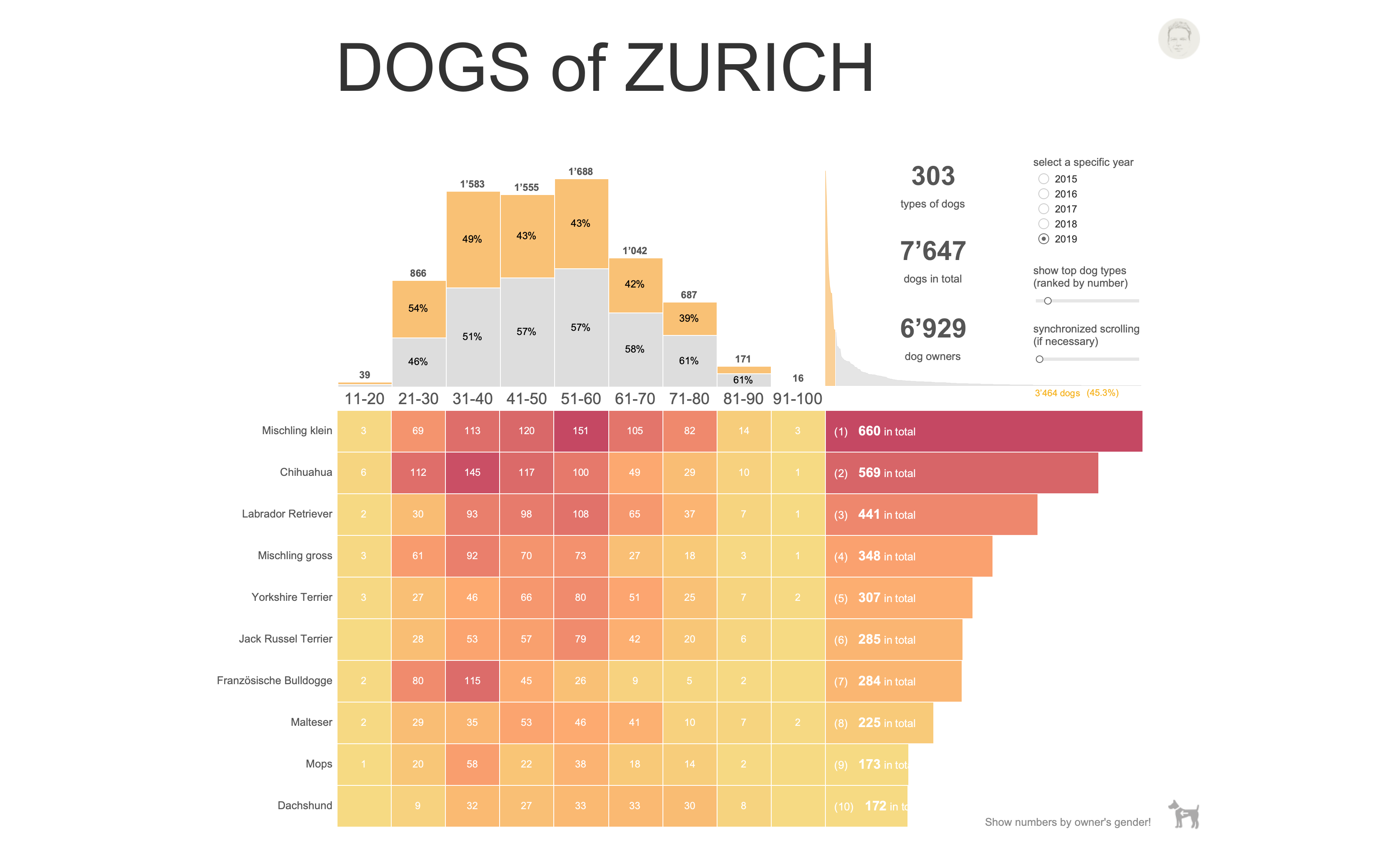
The actual dashboard contains all the information, visualisations and functionality to quickly answer the questions stated above, and, in addition, lets you derive detailed insights about this dataset.
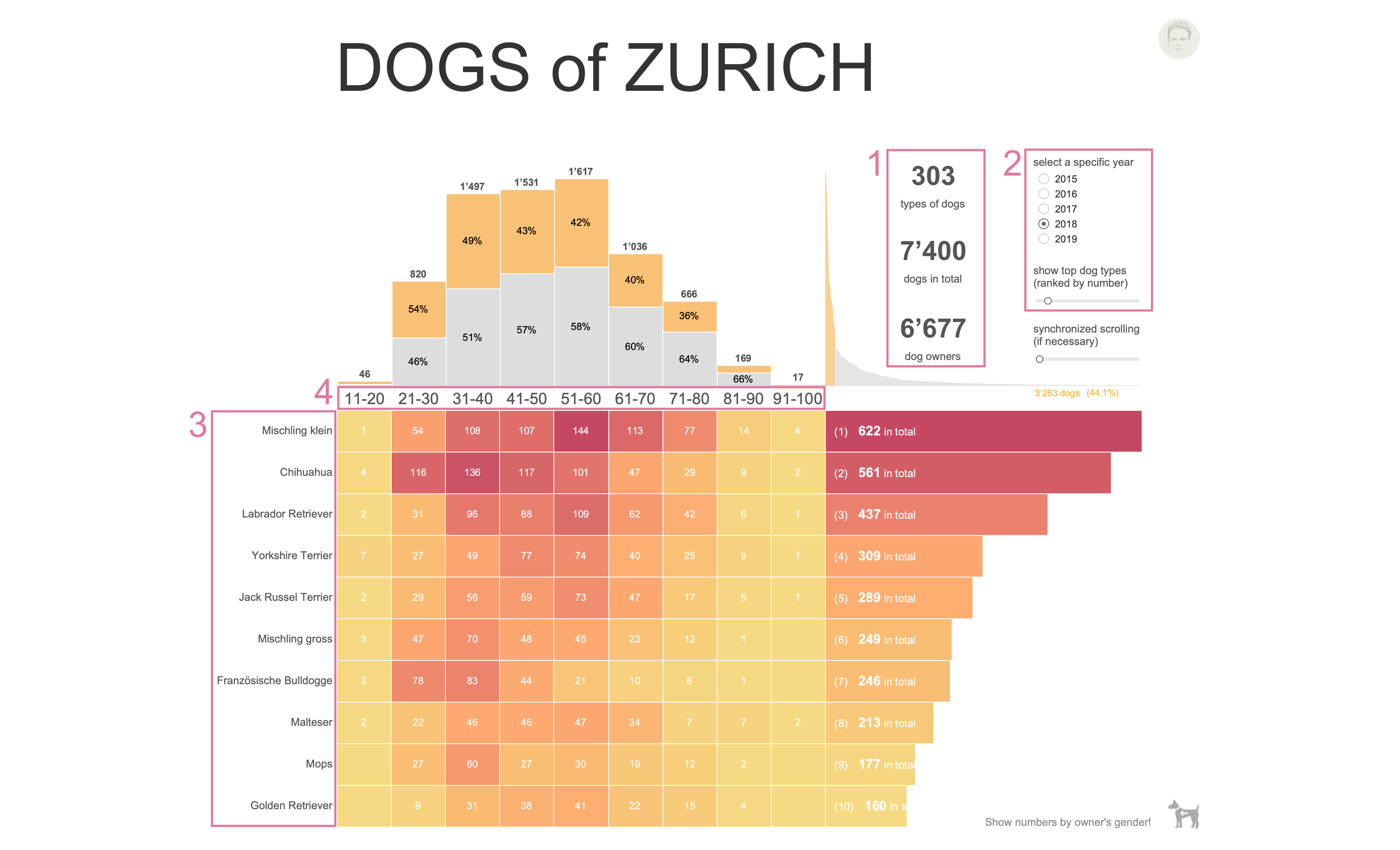
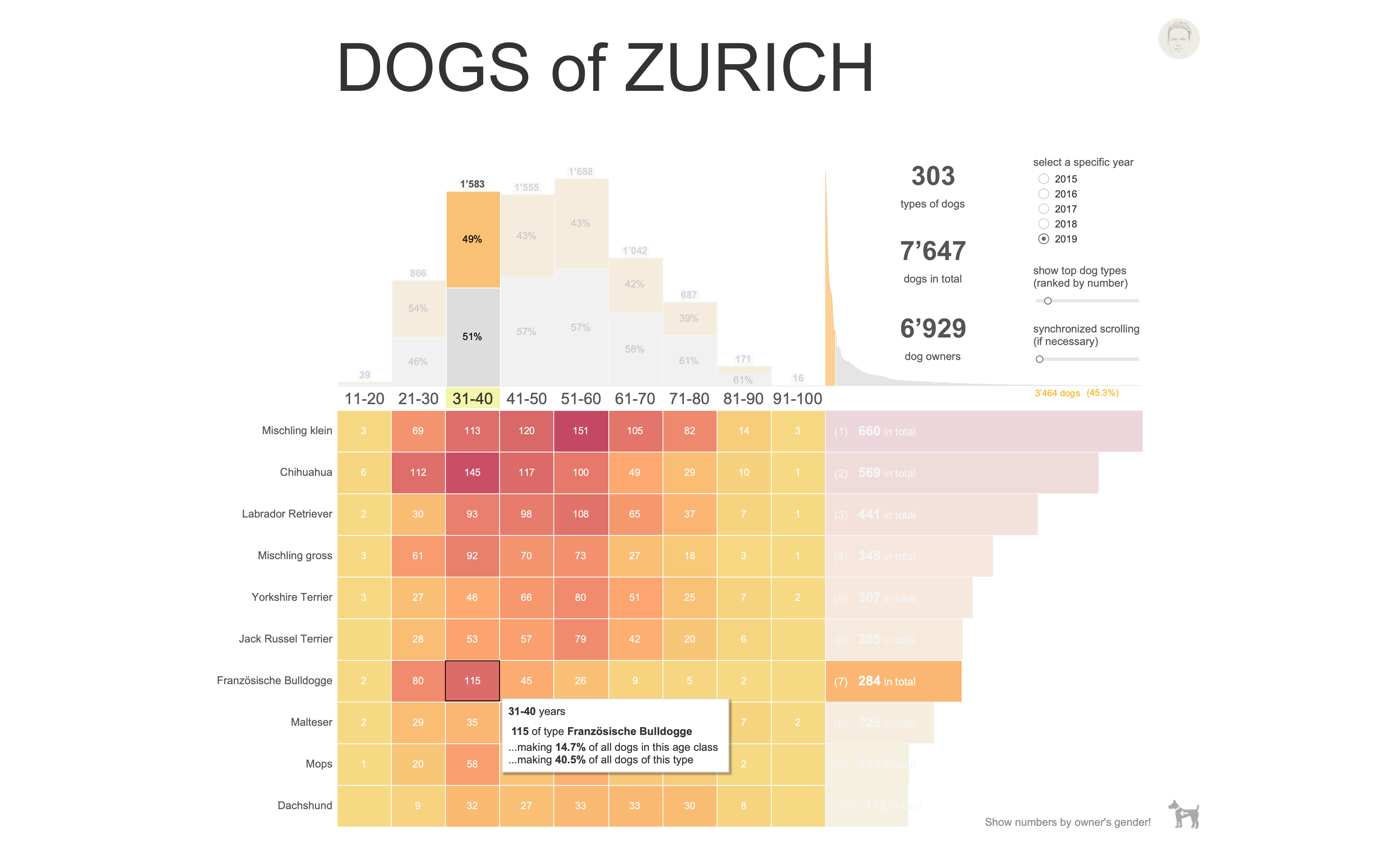
The dashboard shows the same key figures (1) and adjustable parameters (2) as the cover. This helps the viewer quickly get familiar with the dashboard. The detailed information provided here is given by introducing dog types (breeds) (3) and age classes (4) for dog owners. These two categorical variables span a matrix in which the number of dogs is displayed by numbers and colour. Dog types are sorted by numbers in descending order. The result is a heatmap that easily lets you identify which dog types are most popular for a given age class.
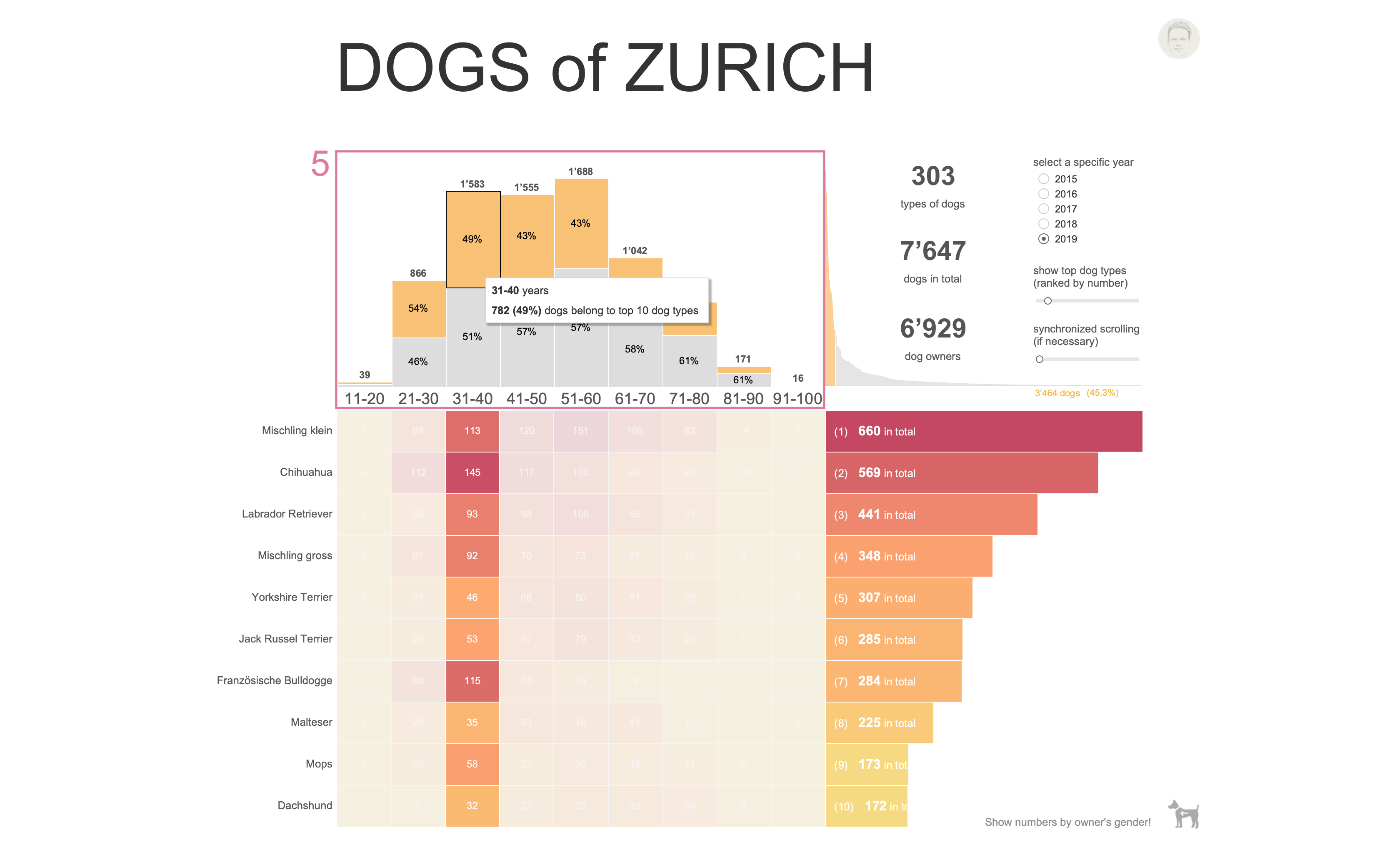
On top of the heatmap I placed a first distribution (5) of dog numbers related to owners’ age classes. In addition, the proportion of top n dog types is coloured in yellow to quickly compare it to all other dog types (grey).
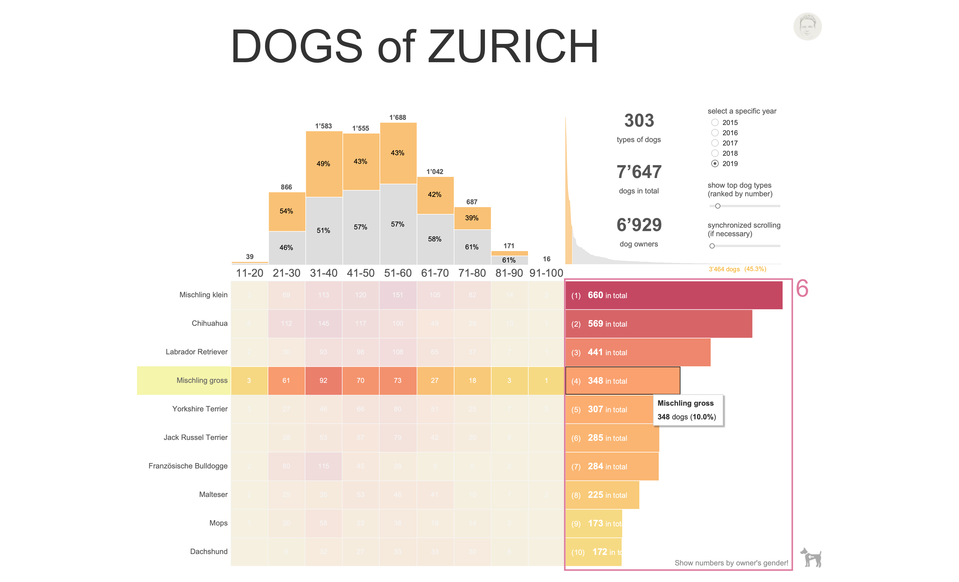
To the right of the heatmap, a second distribution (6) provides the viewer with dog numbers related to the top n dog types as well as the respective rank. When hovering over the bars one can read the type, the number of dogs and its relative contribution to the top n group.
This is the basic design: a heatmap with marginal distributions to the top and right. Now, let’s switch to the actual reasons why I designed this dashboard.
Synchronous scrolling
In general, I’m not a big fan of tables being used in dashboards. That’s something people asked me for very often in my daily work: re-building Excel in Tableau. Not only does this really miss the point of using dashboards, but it also gives you an idea of the mindset of the people and how they think about (visual) data analytics…
What I do like are ranked tables. Whenever one is interested in top-performing branches, most sold products, best-reviewed locations and so on, a ranked table provides this information at a glance. Hence, this type of table can come in very handy from time to time.
However, for design reasons, sometimes one has to combine two or more tables to behave like a single one. That’s when synchronous scrolling comes into play. And that’s not easy to solve with Tableau, in my opinion. I tried a couple of suggestions I found in various Tableau resources. However, none of them are really satisfying. So, in the end, I went with Klaus Schulte’s approach because it’s by far the easiest one.
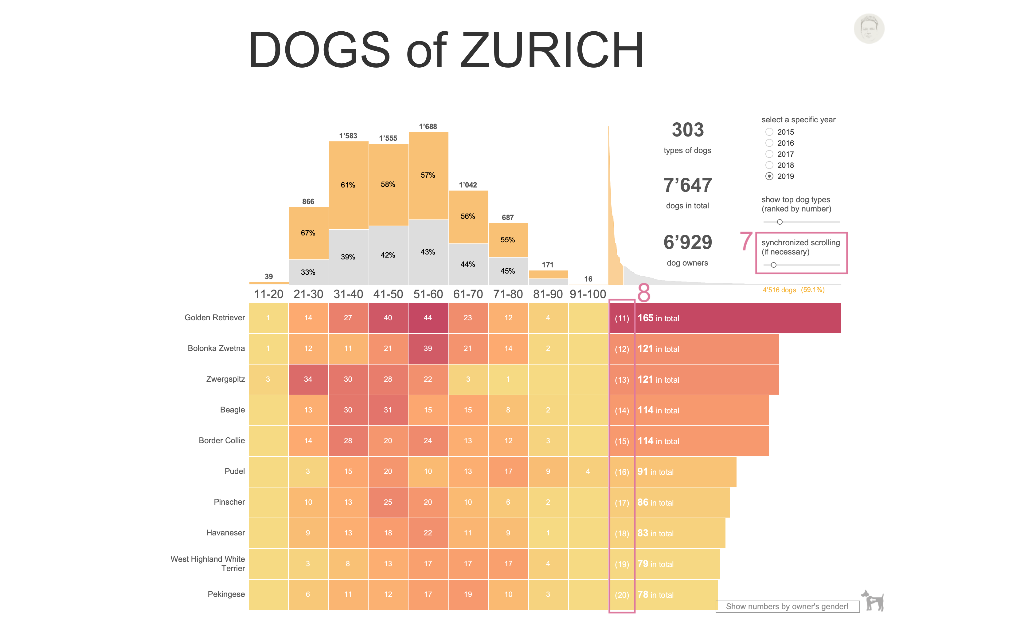
What happens? When looking carefully at the slider for synchronised scrolling (7) one can see that it was moved to the right (its actual value is set to 11). The top n slider value was set to 20. That is, the slider value is used as a filter to show only the values from 11 to top n. Since top n was chosen to be 20, one can see the second half of the top n group starting with rank 11 (8).
It doesn’t work perfectly, especially when using it together with a top n table. But in my opinion, that’s the most straightforward solution. Let me know if you have a better solution!
Switching containers on/off
Switching between two visualisations, e.g., line vs. bar chart, can be done in various ways. For instance, one might use a dual axis chart and make the views dependent on a parameter value (cf. here), or, one uses a container and filter values to select between chart types (cf. here). But, since Tableau version 2019.2, one can make use of a layout container’s show/hide button. You might have a look at Ryan Sleeper’s example on Playfair Data of how to apply it.
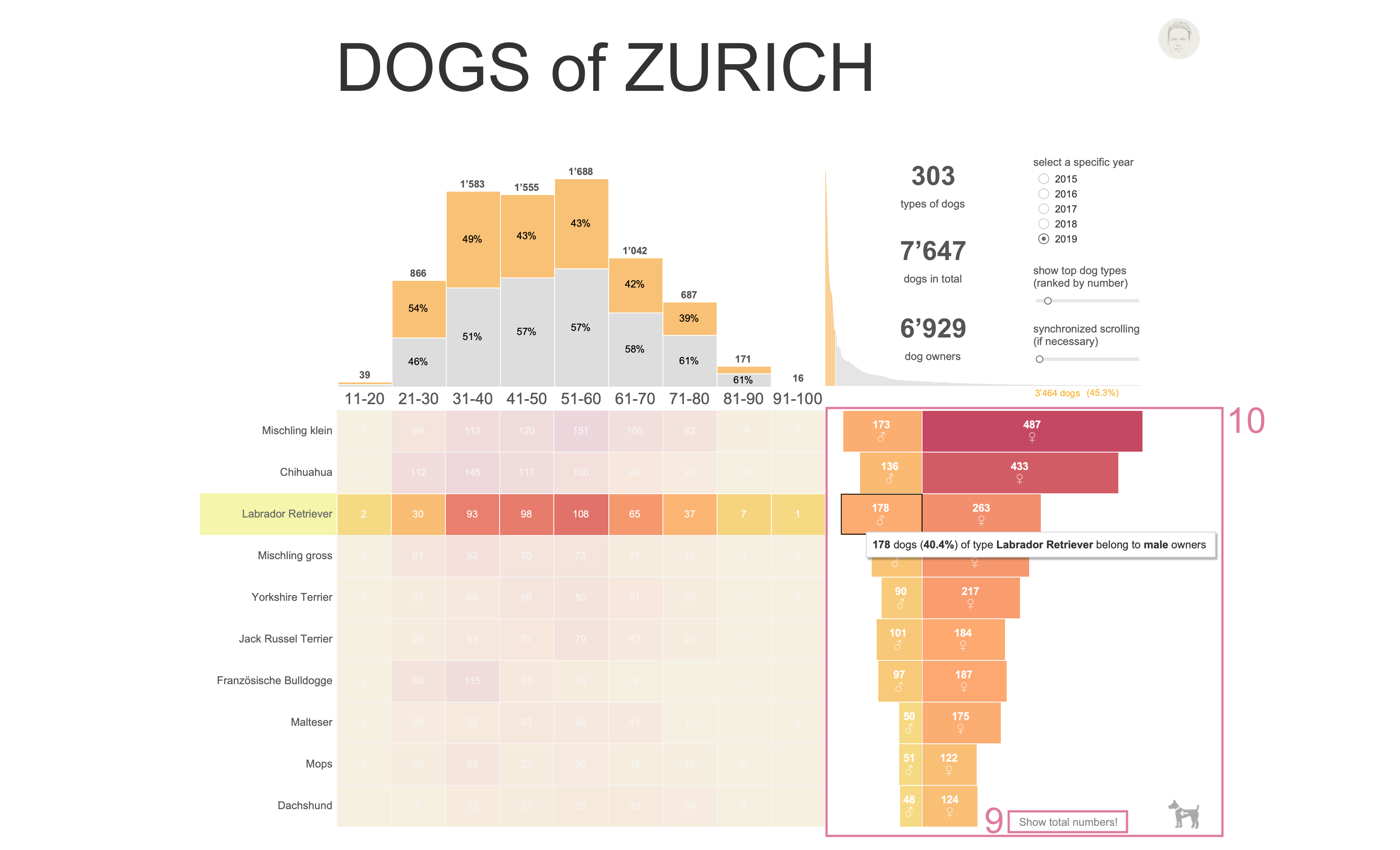
I was using the show/hide button (9) to switch between a chart showing total dog numbers per type and a chart that shows the same data by dog owner’s gender (10). When clicking on the text button, one can switch between both views. I think that’s a very simple and convenient way of showing differing/complementary content.