The global CoViD-19 dashboard allows you to gain an overview and easily track case numbers. You can have a look at the dashboard on Tableau Public or watch the video on Vimeo.
Motivation
When Sars-CoV-2 (the virus) and the disease it causes (CoViD-19) started becoming a pandemic, I wanted to monitor the cases reported by the Center for Systems Science and Engineering (CSSE) at Johns Hopkins University.
There is a dashboard from CSSE already in place that most people have seen due to its immense presence in media:
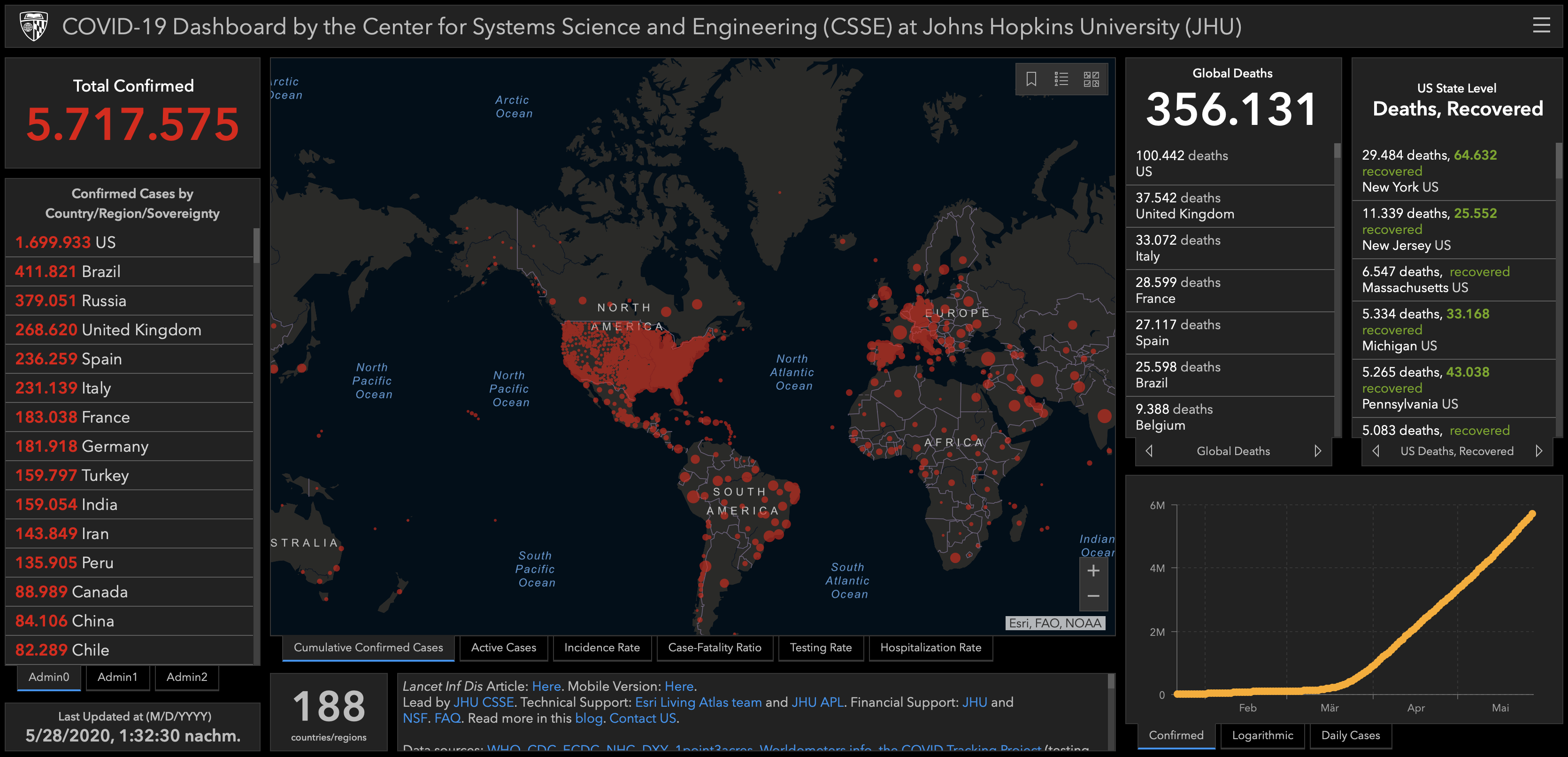
Now, this dashboard is not bad at all. But, I got the feeling that it does not provide me with the overview I am expecting from it. Getting the information you are looking for is not that easy because the dashboard is super packed. Here is an example from the WHO that I consider being much better.
Also, mixing countries and provinces when plotting them on a map does not work, as people are instantly trying to make comparisons between them. E.g., what’s the difference in fatalities between Italy and the US? You have to go to the table to right of the map to see the numbers. But, these are only absolute numbers.
Moreover, I’m not happy with the dark layout and the overly dramatic colours that are used. The numbers are already dramatic themselves and one shouldn’t add an additional layer of alarm to it.
So, I decided to do my very own dashboard using Tableau and Tableau Public. The aim was to
- provide a quick overview about cases on a global and country level,
- get an idea about how the disease develops on these levels, and
- allow for comparisons between countries by using relative numbers (i.e., cases per 100’000 citizens).
Also, the colouring should be neutral to not get distracted by bright reds or blinking gimmicks. In brief, I wanted to create an unbiased and informative dashboard. You can find the result here.
Getting & preparing data
First, I load the required packages tidyverse (data manipulation etc.), janitor (here, solely to use clean_names()) and plotly(for minimal interactive plots). No other packages are needed here.
library(tidyverse)
library(janitor)
library(plotly)
Fortunately, CSSE provides its data in an easily accessible manner: .csv files placed in a GitHub repository. Times series data is stored as three separate files for confirmed cases, deaths and recovered cases. Here’s what I did with the confirmed cases data.
# confirmed cases
# Connect to the repository and read the raw .csv file:
dd_org_confirmed = read_csv(url("https://raw.githubusercontent.com/CSSEGISandData/COVID-19/master/csse_covid_19_data/csse_covid_19_time_series/time_series_covid19_confirmed_global.csv")) %>%
	# If information on provinces is needed you might uncomment this line:
  	# select(., -c("Province/State")) %>%
	# Transform to long format.
  	pivot_longer(., cols = -c("Country/Region", "Province/State", "Lat", "Long"), names_to = "Date", values_to = "confirmed")
The same is done for deaths and recovered cases.
# deaths
dd_org_deaths = read_csv(url("https://raw.githubusercontent.com/CSSEGISandData/COVID-19/master/csse_covid_19_data/csse_covid_19_time_series/time_series_covid19_deaths_global.csv")) %>%
  	pivot_longer(., cols = -c("Country/Region", "Province/State", "Lat", "Long"), names_to = "Date", values_to = "deaths")

# recovered
dd_org_recovered = read_csv(url("https://raw.githubusercontent.com/CSSEGISandData/COVID-19/master/csse_covid_19_data/csse_covid_19_time_series/time_series_covid19_recovered_global.csv")) %>%
  	pivot_longer(., cols = -c("Country/Region", "Province/State", "Lat", "Long"), names_to = "Date", values_to = "recovered")
All three datasets are combined to a single one that contains all information, including active cases being calculated as the sum of confirmed cases minus deaths and recovered cases.
dd <- dd_org_confirmed %>%
	# Combine datasets by left-joining these:
  	left_join(., dd_org_deaths, by = c("Country/Region", "Province/State", "Date", "Lat", "Long"), copy = FALSE, keep = FALSE) %>%
  	left_join(., dd_org_recovered, by = c("Country/Region", "Province/State", "Date", "Lat", "Long"), copy = FALSE, keep = FALSE) %>%
  	# Adding a new variable for active cases:
  	mutate(active = confirmed - deaths - recovered,
         Date = mdy(Date)) %>%
    # Collapse case types to a single variable denoted 'status':
  	pivot_longer(., cols = c(confirmed, deaths, recovered, active), names_to = "status", values_to = "cases") %>%
  	# Clean variable names:
  	clean_names()
Now, a quick check what the data looks like.
str(dd)
head(dd)
And a brief graphical check using data for Germany:
ggplotly(dd %>%
	filter(., country_region == "Germany") %>%
	ggplot(aes(x = date, y = cases, colour = status)) +
	geom_line() +
	labs(title = "CoViD-19 cases for Germany") +
	xlab("") +
	ylab("") +
	scale_colour_manual(values = c("#D8A94F", "#4E4E4C", "#A44A51", "#6378AC")) +
	theme_minimal() +
	theme(legend.title = element_blank()))
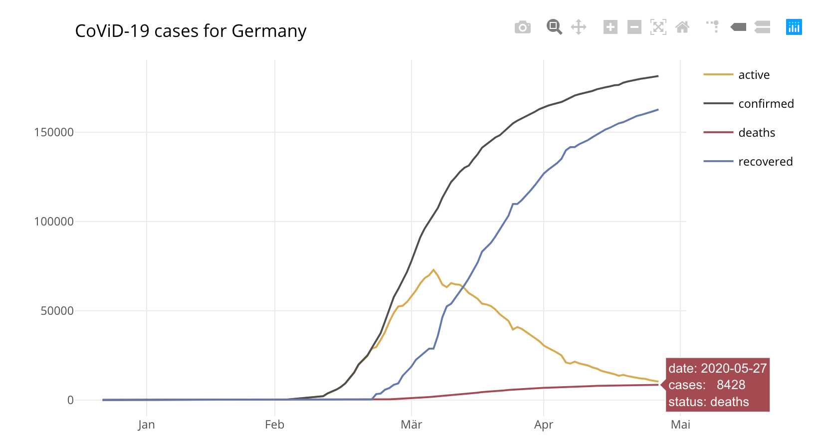
Looks good!
Finally, I export the the data to a .csv file on my computer. Alternatively, one could save the data to another repository and connect Tableau to it via a web connector. But, for now, I stay with this approach.
# Export to .csv file.
write.csv(dd, "user_path/covid_time_series.csv")
Designing the dashboard
The unbiased and informative dashboard is designed as a tool. It is not an infographic. Hence, it looks simple on a first glance, but allows to go deeper by making extensive use of tooltips. Further, it uses simple graphics that are easy to understand. I do not want viewers being busy figuring out how to read a sunburst chart to pull out the information she/he is looking for. Rather, it should be possible to quickly answer questions like:
- Which country is facing most fatalities?
- How much confirmed CoViD-19 cases does Germany have relative to its population size? How does that compare to Italy?
- How are numbers developing in Brazil? What’s the global trend?
- How are numbers (relatively) changing compared to the previous day?
The dashboard consists of mainly five parts:
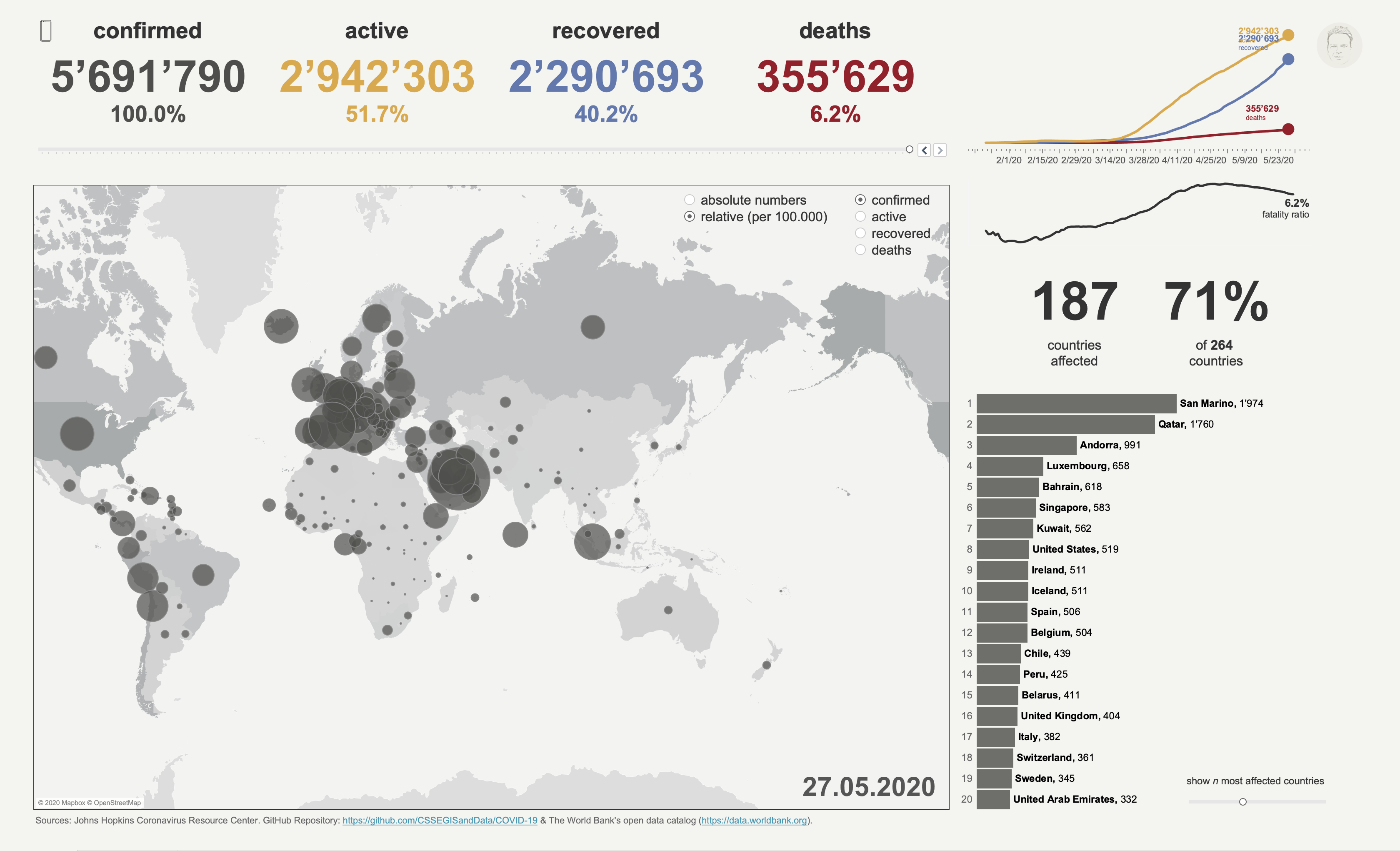
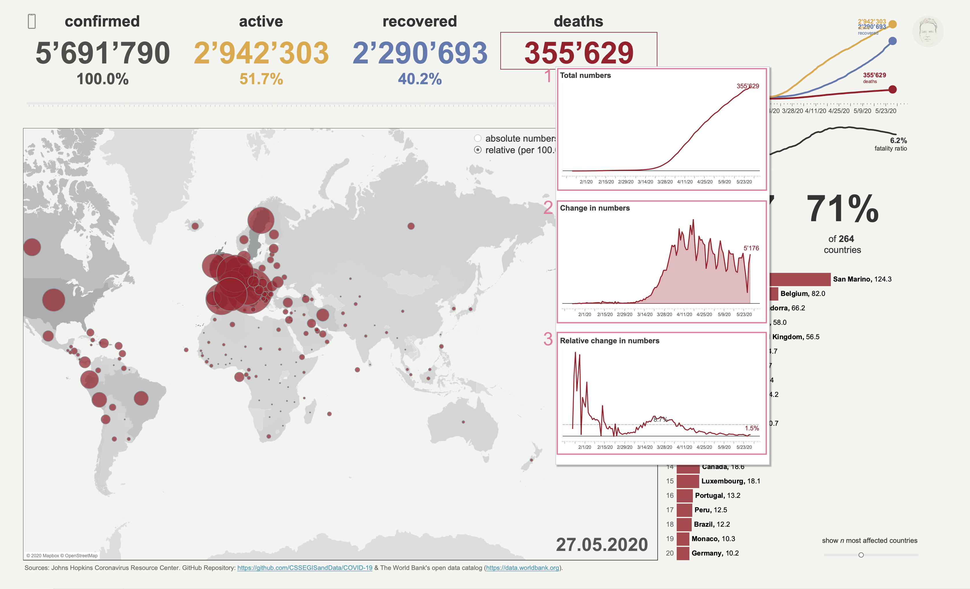
- The upper panel (1) includes global numbers for confirmed, active and recovered cases as well as fatalities. Moreover, a line chart allows for a quick overview about cumulated cases. The date slider allows to select a specific date of interest.
- The map (2) as the central place to identify which parts of the world or countries are affected the most. Also, the map provides details for each country allowing fast comparisons.
- A small side panel (3) showing the number of countries affected as well as the course of the case fatality ratio (number of fatalities relative to the number of confirmed cases).
- A bar chart (4) showing countries ranked according to the selected case type.
- A supplementary dashboard (5) providing key indicators for a selected country. One is forwarded to this dashboard when clicking on a country, either on the map, or, in the bar chart.
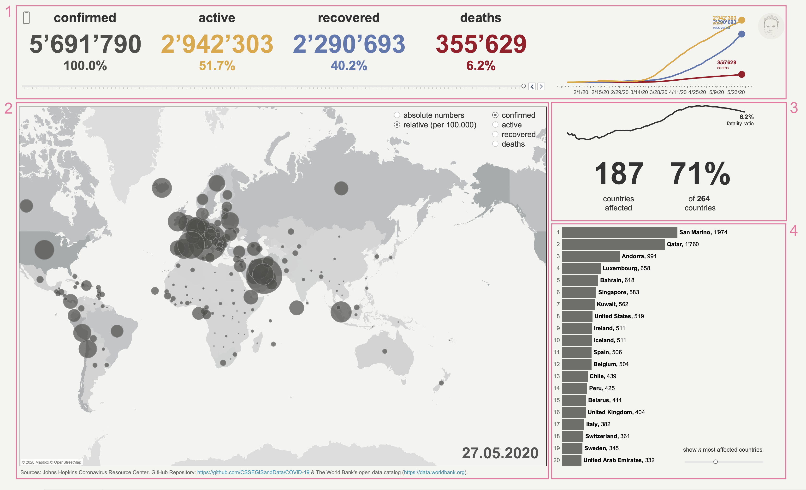
1 Upper panel
The four main numbers show global case numbers. By hovering over a number the viewer can see the the total numbers over time (1), the daily change in numbers (2) as well as the relative change compared to the previous day (3). That is, in the example below you can see that on May 27 the global death toll was 355’629, with a 1.5% increase (5’176) compared to May 26.
2 Map
Though Tableau includes a couple of nice maps, I decided to create one in Mapbox by myself. It’s pretty easy and a lot of fun to play around with Mapbox Studio!
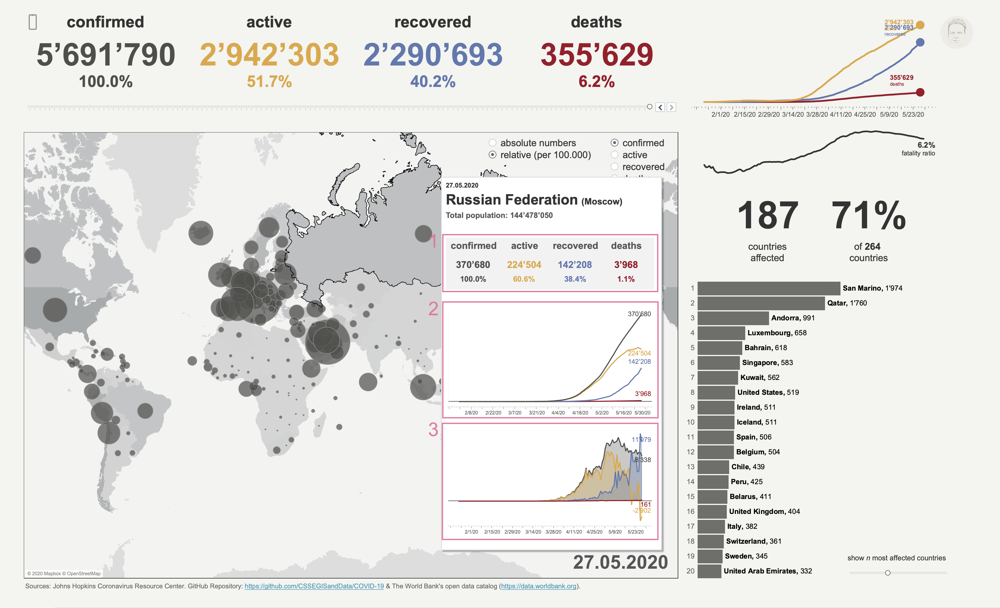
The map should be a simple choropleth map with circles layered on top (sizes representing case numbers). By hovering over a specific country one gets the key numbers from the upper panel refined for the specific country (1) as well insights about the temporal development of accumulated (2) and daily (3) cases.
From the list menu on can select the circles to either show absolute case numbers, or, which makes more sense when comparing countries, relative numbers (cases per 100’000 citizens). Also, one can decide which case type to show, e.g., confirmed cases or fatalities.
3 Small side panel
The small side panel simply shows the temporal course of the case fatality ratio (1) as well as the total numbers of countries affected and their share of all countries in the world (2).
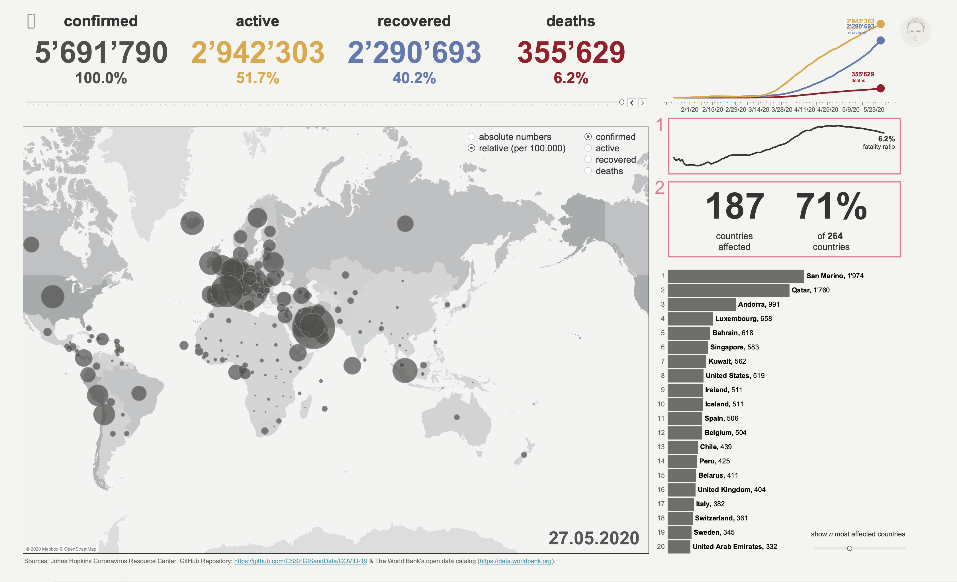
4 Bar chart
The bar chart ranks countries according to the choices made in the respective list menus, e.g., relative confirmed cases. This allows one to easily see how strongly countries are affected and how they compare to each other.
In addition, when hovering over a bar one gets a detailed view on the case type selected for this country: accumulated cases (2), daily change (3) and relative change compared to previous day (4). The main numbers (1) from the upper panel are again shown on the top.
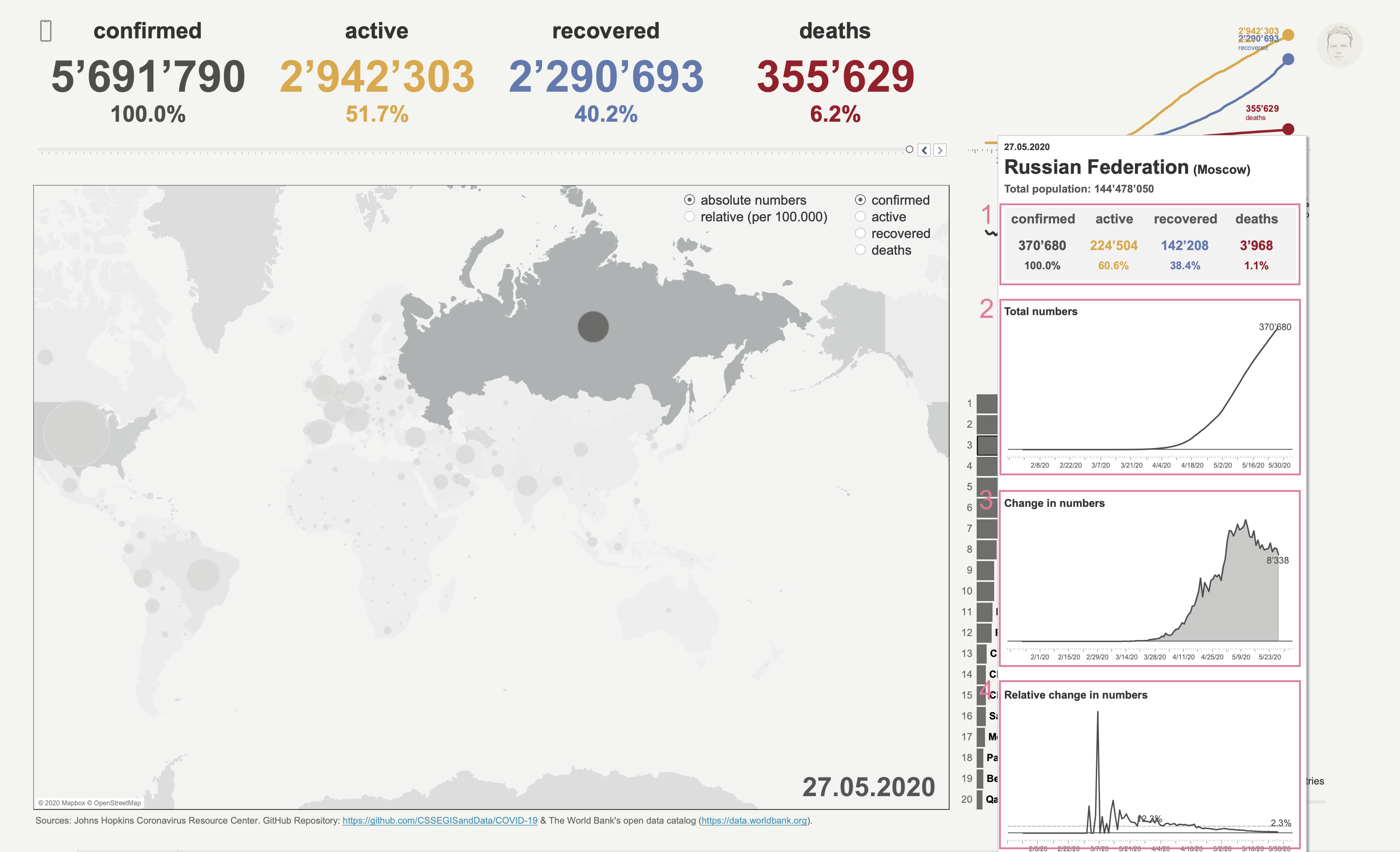
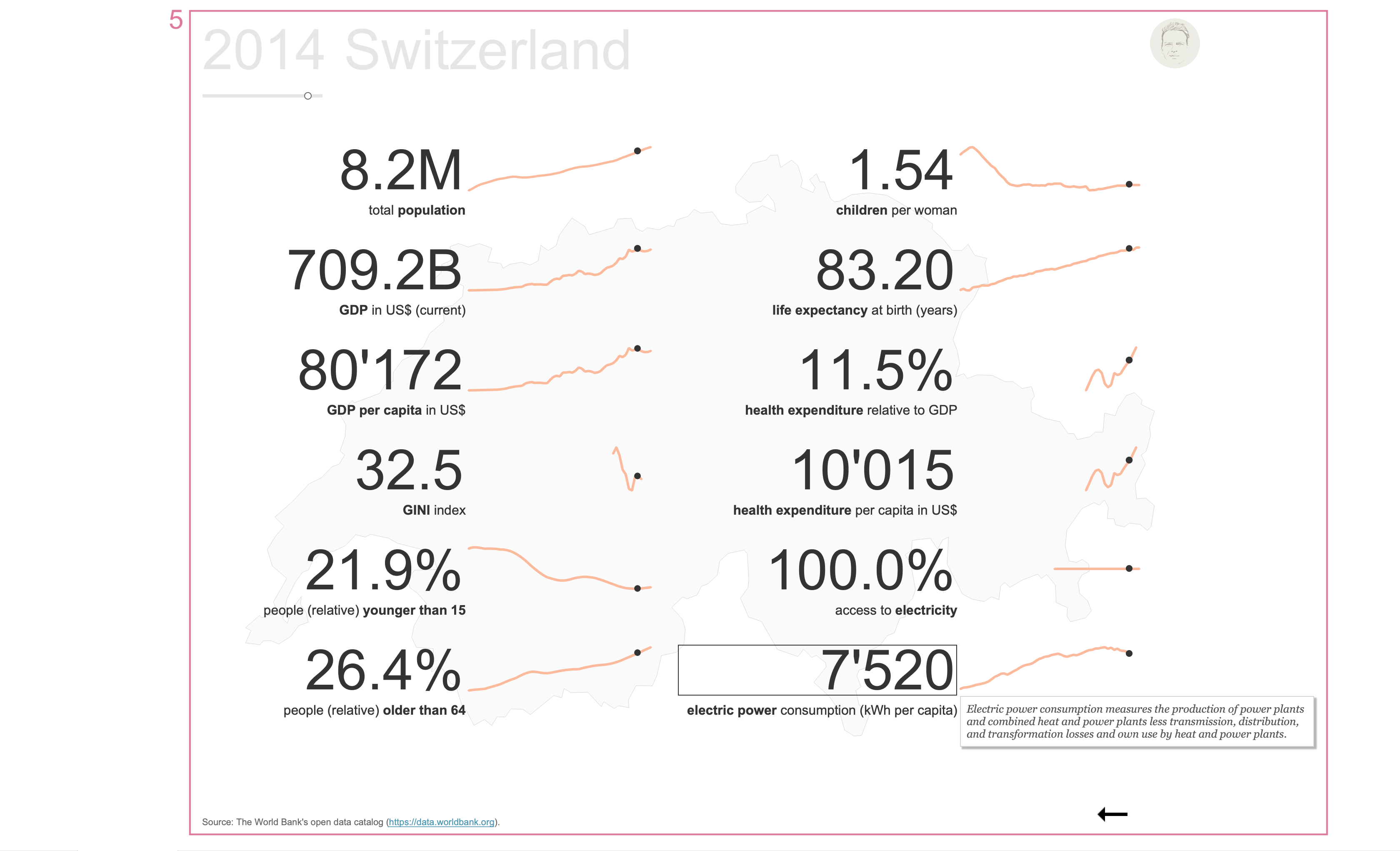
5 Supplementary dashboard
One is referred to this dashboard when clicking on a country – either on the map or in the bar chart. This dashboard allows the viewer to get additional information about a country, such as GDP or health care spendings. The data was retrieved from The World Bank’s data catalogue. When hovering over an indicator the tooltip shows the exact definition.
I included this dashboard because I was wondering how well a country can respond to this crisis given its population size, its financial means or the access to electricity. However, these are just indicators and there is no direct link or causality to the response performance. For instance, the United States of America have by far the highest health care expenditures relative to GDP. But inefficiencies and political incompetence resulted in a dramatic course of CoViD-19.
Mobile version
This dashboard was designed primarily for desktop view. However, when clicking on the mobile phone icon on the top left one can get forwarded to the respective version which gives a much better experience when looking at it on a phone. You can also click here. =)