Building an interactive CV with Tableau
…is a very different experience compared to how you normally use Tableau. Instead of analysing your data according to (sub)categories, taking care of aggregated measures and how to calculate these and so on, you rather try to convert a sketch into a dashboard and build a couple of minimal data files to fill it with content. My idea was to make the dashboard look similar to my one-pager CV. That is, my portrait picture, the timeline, the colours used etc. should all look similar to generate something like a ‘corporate identity’.
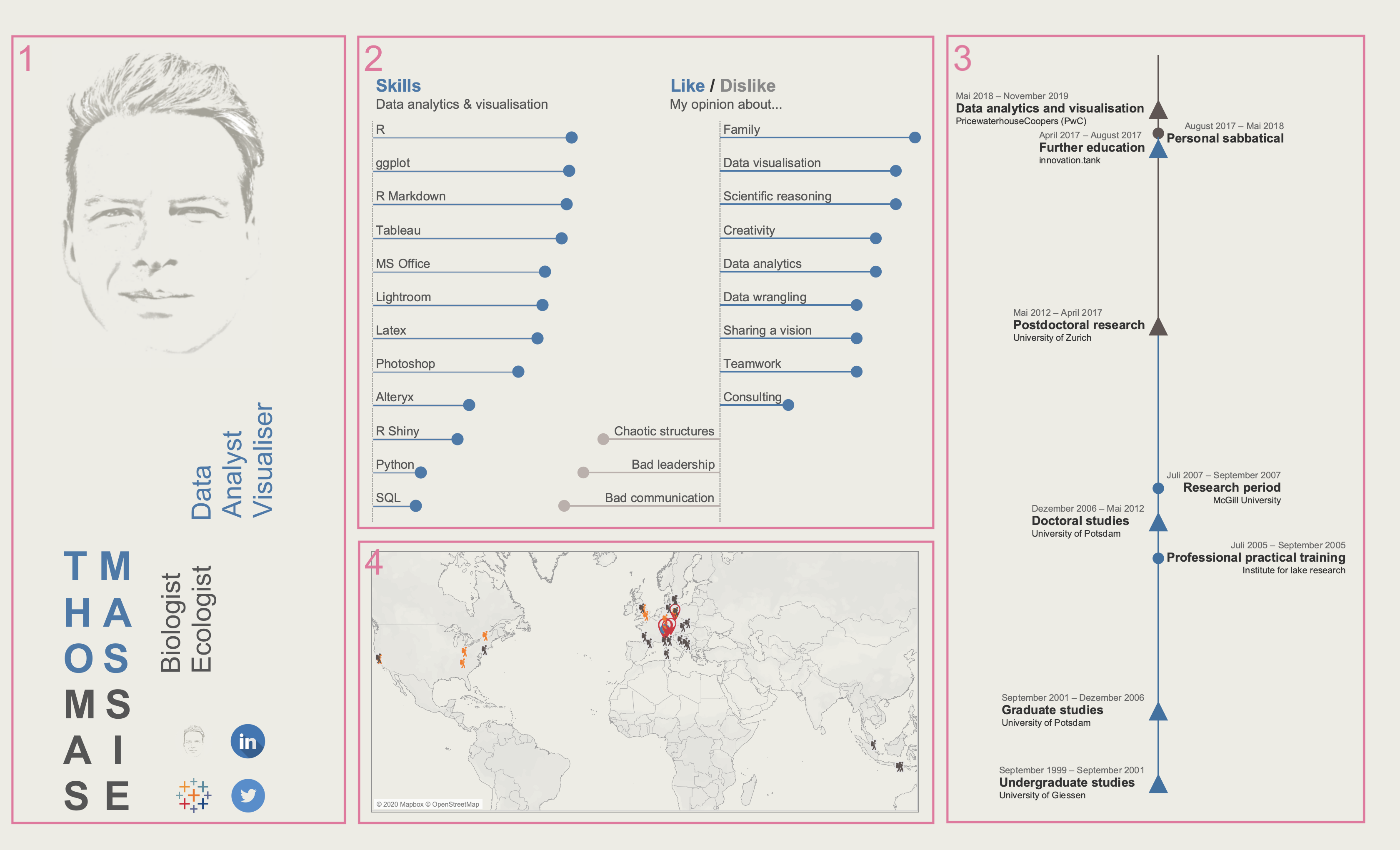
When you look at the overview of the dashboard above you may recognise that I divided the dashboard into four major parts: a portrait picture, my name, my profession and four profile links (1), two lollipop charts reflecting the strength of certain skills and opinions (2), a timeline showing my career from when I started studying biology until my recent employment with PwC (3), and, finally, a map depicting a couple of places I had the chance to visit in the past (4). Let’s quickly go through the different parts:
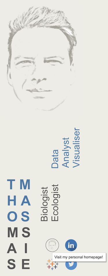
1 Portrait
I used the portrait picture from the CV mentioned above and placed it in the top-left corner. It’s the area your eyes will focus on first. Next, I was playing around with my name. The fact that three letter in my first and last name overlap (thoMASsie) lead me to the idea of displaying the four parts (THO MAS MAS SIE) by a 2x2 matrix. Using two colours supports reading my name in two different ways: top-down by columns, or left-right by rows.I was using the two colours also for my profession by training (biologist/ecologist, grey) and by my current scope of work (data analyst/visualiser, blue). Finally, I included icons of my personal homepage, LinkedIn, Tableau Public and Twitter as well as the links referring to the respective profiles when clicking on the icons.
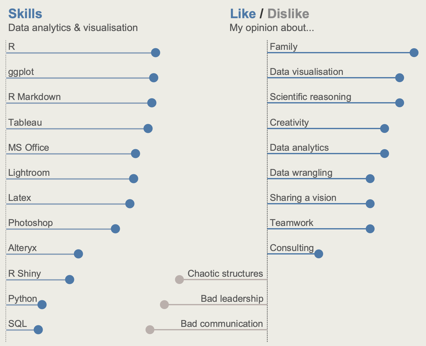
2 Skills and opinions
Next, I wanted to provide an overview about my skills and proficiency (left side), and about certain things I (dis)like (right side). I decided for lollipop charts because their are lighter than bar charts, but provide the same visual perception: clean, clear and fast. When looking closely you can see that the two charts overlap a bit. I arranged them like this to make better use of space on the dashboard. Also, I’m not a huge fan of dashboards that use a tile approach to display different elements. I think it makes a dashboard look more technical than necessary and, even worse, one might get the impression that the dashboard was designed using default settings. I’m not a huge fan of that…
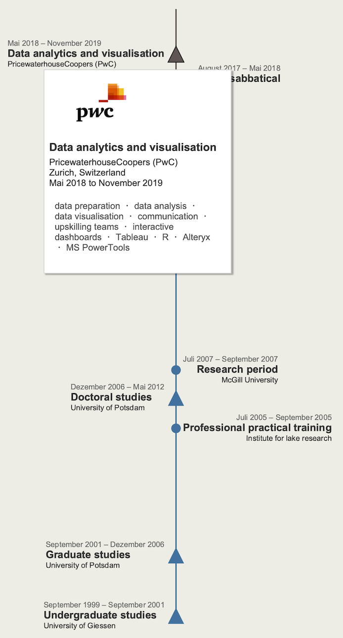
3 Timeline
I placed the timeline to the right as it, together with the portrait, serves as a frame for the entire dashboard. You can immediately see the different stages in my career. And when hovering over a specific stage, the tooltip provides you with additional information. It’s also a nice way of including the company’s or university’s icon into the visualisation. Creating labels to the left and right of the stages could only be realised by overlaying two charts. Basically, there’s no problem in doing so. Without any filling, both charts complement each other to one pretty timeline. However, there’s a major drawback here: all interactive elements, such as tooltips, from the subjacent chart cannot be accessed. So, if you hover over my research period at McGill University you cannot see any tooltip popping up. Would be cool if this could be resolved in the future.
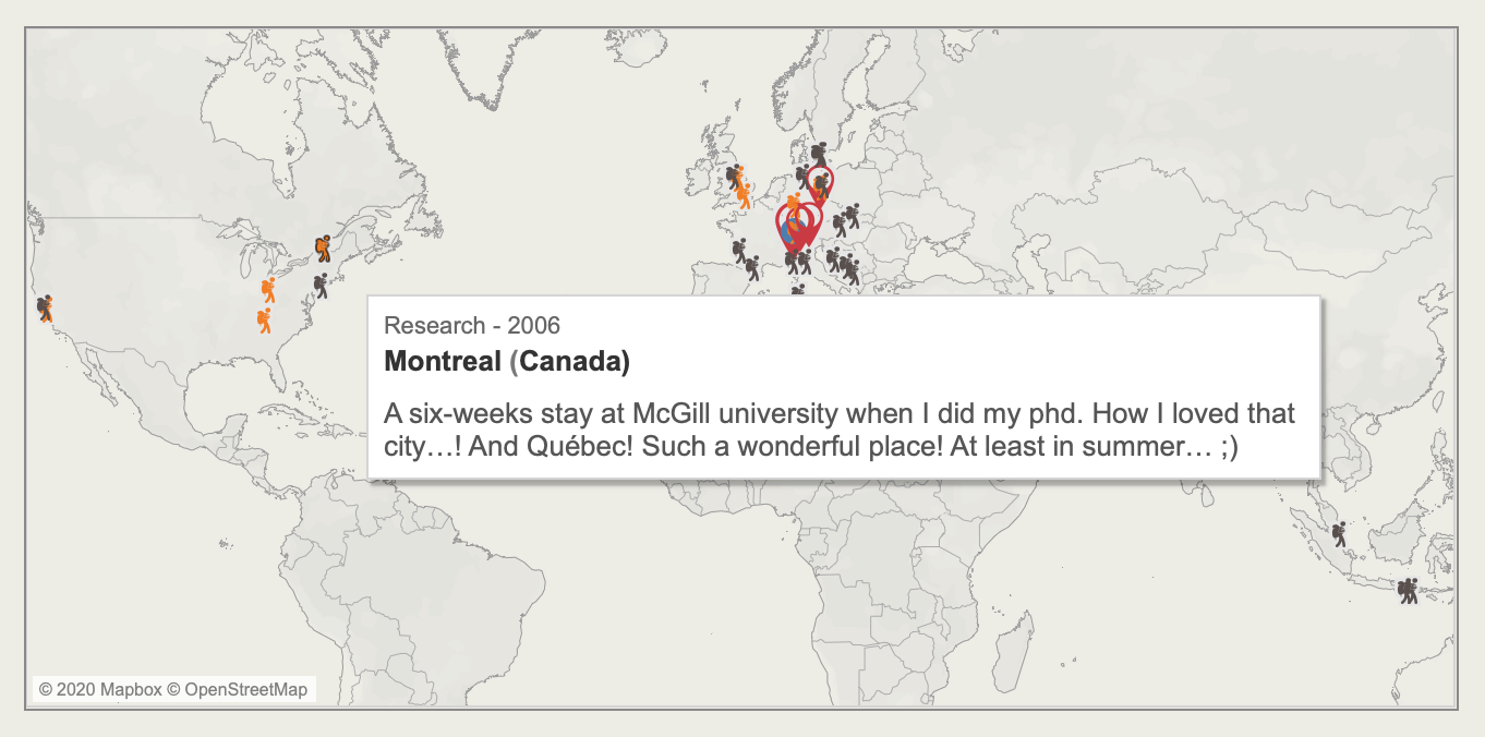
4 Map
Last, I included a map. Why? Because by displaying geographical data it’s a completely different element on the dashboard. Any why not showing people a couple of the places that you’ve been to? The map uses Tableau’s default map. I was actually creating a custom map with Mapbox, which is an absolutely amazing map service. However, it wasn’t loading the first time I uploaded my CV to Tableau Public and, hence, I turned back to the dafult map.