Displaying proportional data, i.e., subsets of data that contribute to a whole, can be done in various ways. However, two particular suitable types of visualisations are isotypes and waffle charts.
By making use of isotypes (international system of typographic picture education), one automatically switches from a continuous representation of data to a (semi-)discrete one: each isotype stands for a specific proportion (e.g., 1’000 people) that can easily be summed up by the viewer (23 isotypes make 23’000 people). Also, the viewer can often much better relate to a specific topic compared to when looking at plain percentage bars.
A waffle chart provides a means to graphically display proportions of a whole. Search for it and you will find numerous examples. It is a cool alternative to a pie chart, including the very same restrictions (e.g., number of categories). However, it’s discrete with each cell representing a specific proportion of the whole. For instance, a 10 by 10 matrix waffle results in 100 cells and is therefore very well-suited for displaying percentages. In combination with isotypes, waffle charts get really impressive!
How to do this in R? It’s pretty easy, actually. Just have a look at these two tutorials:
- How to Create Waffle Charts in R by Beth Hastings on Medium, using the
wafflepackage. - Create infographics in R by Deepanshu Bhalla on Listen Data, using the
wafflepackage, too, but also showing another approach using theecharts4rpackage by Jon Coene.
With these two sources, but especially the latter one, I got pretty far. However, there is one tiny but still very annoying detail you might come across: using percentages and rounding these to then be included into a waffle chart can result in a total less than 100%. Imagine four categories that contribute with 12.32%, 29.23% and 58.45% to a total of 100.00%. Now, when rounded to zero decimals, one gets 12%, 29% and 58% which results in a sum of 99% and makes your isotype waffle chart look pretty awkward.
I found a solution to this quite common problem here. It works just fine!
round_preserve <- function(x, digits = 0) {
    up <-  10 ^ digits
    x <-  x * up
    y <-  floor(x)
    indices <-  tail(order(x-y), round(sum(x)) - sum(y))
    y[indices] <-  y[indices] + 1
    y / up
}
Now, with including this little tweak, I could finally create a waffle chart that is included in a Shiny app I designed to generate publication-ready visuals.
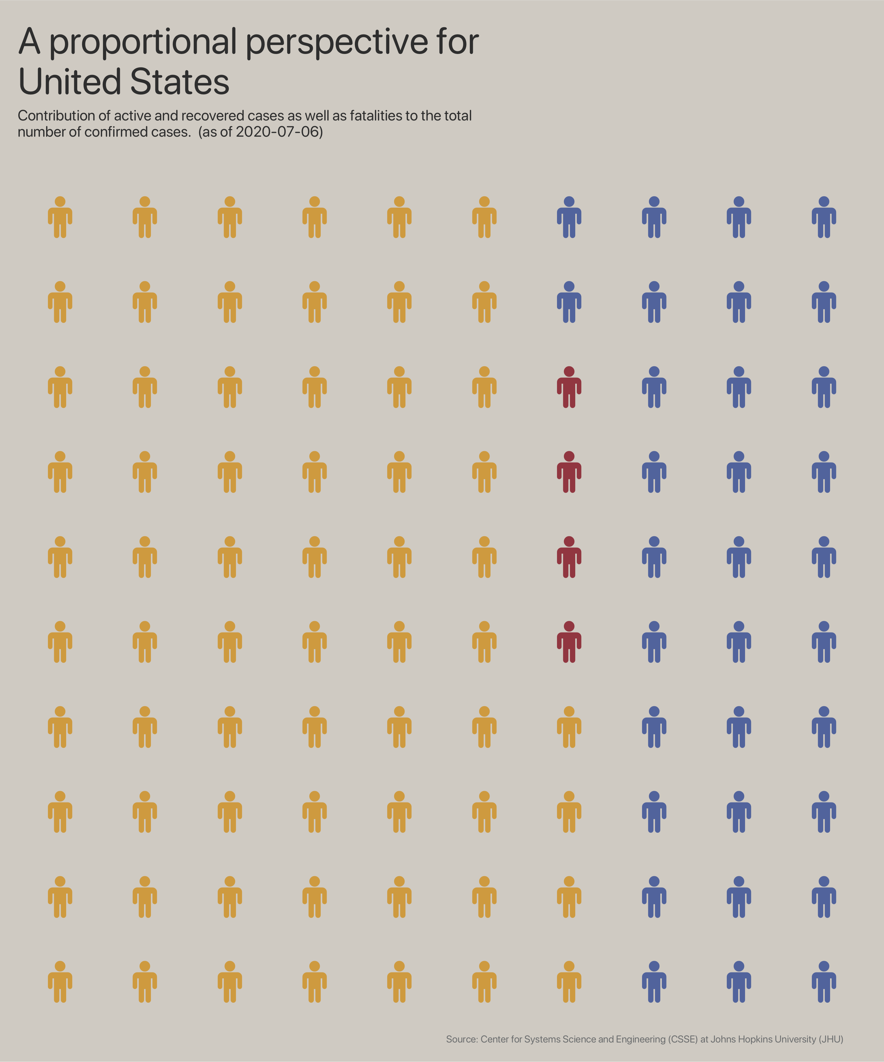
In my opinion, the isotype waffle chart above allows for a very quick overview of how many fatalities (red) there are in relation to all confirmed cases in the United States of America: 4 red isotypes make 4% fatalities of all confirmed cases.