Storm data exploration (1/n)
Loading the environment
# Entire workspace.
source_data("https://github.com/thomassie/Storms/blob/master/Preparation/StormDataWorkSpace.RData?raw=true")
## [1] ".Random.seed" "dd.pacific"   "i"            "dd"
## [5] "n"            "dd.atlantic"  "dd.i"         "dd.org"
Exploring the data set
First, I generate two data set that include a couple of summary statistics such as minimum pressure or maximum duration for each storm…
# Some summary statistics to see which was the strongest storm etc.
dd.sum <- dd %>%
  group_by(Key) %>%
  summarise(Name = unique(Name),
            KeyPlus = unique(KeyPlus),
            Ocean = unique(Ocean),
            Year = first(Year),
            MinPressure = min(Pressure, na.rm = TRUE),
            MaxDuration = max(Duration, na.rm = TRUE),
            MeanWindKPH = round(mean(WindKPH, 0)),
            MaxWindKPH = max(WindKPH, na.rm = TRUE),
            StormStart = format(DateTime[1], "%d/%m %H:%M:%S"),
            StormStop = format(DateTime[length(DateTime)], "%d/%m %H:%M:%S")) %>%
  arrange(-desc(Year)) %>%
  mutate(MinPressureAfter = "NA")

for (i in 1:length(dd.sum$Key)) {
  dd.sum$MinPressureAfter[i] = max(filter(dd, Key == dd.sum$Key[i])$Duration[which(filter(dd, Key == dd.sum$Key[i])$Pressure %in% min(filter(dd, Key == dd.sum$Key[i])$Pressure, na.rm = TRUE))])
}

dd.sum$MinPressureAfter <- as.numeric(dd.sum$MinPressureAfter)

# '-Inf' and 'Inf' values are not useful here.
# If these values are not removed they later appear in the plots.
dd.sum$MinPressure <- as.numeric(gsub("Inf", "NA", dd.sum$MinPressure))
dd.sum$MinPressureAfter <- as.numeric(gsub("-Inf", "NA", dd.sum$MinPressureAfter))

str(dd.sum)
## Classes 'tbl_df', 'tbl' and 'data.frame':	2900 obs. of  12 variables:
##  $ Key             : Factor w/ 2900 levels "AL011851","AL011852",..: 1 167 332 497 661 818 2 168 333 498 ...
##  $ Name            : chr  "UNNAMED" "UNNAMED" "UNNAMED" "UNNAMED" ...
##  $ KeyPlus         : Factor w/ 2900 levels "ABBY (AL011968)",..: 1598 1725 1847 1965 2078 2186 1599 1726 1848 1966 ...
##  $ Ocean           : Factor w/ 2 levels "Atlantic","Pacific": 1 1 1 1 1 1 1 1 1 1 ...
##  $ Year            : Factor w/ 166 levels "1851","1852",..: 1 1 1 1 1 1 2 2 2 2 ...
##  $ MinPressure     : num  NA NA NA NA NA NA 961 NA NA NA ...
##  $ MaxDuration     : num  3 0 0 11.75 3.75 ...
##  $ MeanWindKPH     : num  98 129 80 105 80 85 118 93 108 117 ...
##  $ MaxWindKPH      : num  129 129 80 161 80 97 161 113 113 129 ...
##  $ StormStart      : chr  "25/06 00:00:00" "05/07 12:00:00" "10/07 12:00:00" "16/08 00:00:00" ...
##  $ StormStop       : chr  "28/06 00:00:00" "05/07 12:00:00" "10/07 12:00:00" "27/08 18:00:00" ...
##  $ MinPressureAfter: num  NA NA NA NA NA NA 7.25 NA NA NA ...
…and for each year. I will use the latter data set mainly for mapping (see blow).
dd.sum.year <- dd %>%
  group_by(Year) %>%
  summarise(DateTime = first(DateTime),
            # Date = first(DateTime.new[which(Minimum.Pressure == min(Minimum.Pressure, na.rm = TRUE))]),
            MinPressure = min(Pressure, na.rm = TRUE),
            MaxDuration = max(Duration, na.rm = TRUE),
            MeanWindKPH = round(mean(WindKPH, 0)),
            MaxWindKPH = max(WindKPH, na.rm = TRUE),
            NumStorms = length(unique(Key)),
            Items = length(Pressure)) %>%
  arrange(-desc(Year))

# Again, 'Inf' values are not useful here.
dd.sum.year$MinPressure <- as.numeric(gsub("Inf", "NA", dd.sum.year$MinPressure))
But first, I have to assign the exact dates and times for these annual extreme values.
# Get exact date and time for all extreme values!
p.min <- rep(NA, length(unique(dd$Year)))
d.max <- p.min
w.max <- p.min
for (i in 1:length(unique(dd$Year))) {
  p.min[i] = first(filter(dd,
                          Year == unique(dd$Year)[i] &
                            Pressure == as.character(dd.sum.year$MinPressure[i]))$DateTime)
  d.max[i] = first(filter(dd,
                          Year == unique(dd$Year)[i] &
                            Duration == as.character(dd.sum.year$MaxDuration[i]))$DateTime)
  w.max[i] = first(filter(dd,
                          Year == unique(dd$Year)[i] &
                            WindKPH == as.character(dd.sum.year$MaxWindKPH[i]))$DateTime)
}

dd.sum.year <- dd.sum.year %>%
  mutate(DateTime.p = as.POSIXct(p.min, origin = "1970-01-01")) %>%
  mutate(DateTime.d = as.POSIXct(d.max, origin = "1970-01-01")) %>%
  mutate(DateTime.w = as.POSIXct(w.max, origin = "1970-01-01"))
str(dd.sum.year)
## Classes 'tbl_df', 'tbl' and 'data.frame':	166 obs. of  11 variables:
##  $ Year       : Factor w/ 166 levels "1851","1852",..: 1 2 3 4 5 6 7 8 9 10 ...
##  $ DateTime   : POSIXct, format: "1851-06-25 00:00:00" "1852-08-19 00:00:00" ...
##  $ MinPressure: num  NA 961 924 938 997 934 961 979 938 NA ...
##  $ MaxDuration: num  11.75 11 11.75 5.75 3.75 ...
##  $ MeanWindKPH: num  96 117 135 114 115 111 107 116 119 113 ...
##  $ MaxWindKPH : num  161 161 209 177 177 209 145 145 177 177 ...
##  $ NumStorms  : int  6 5 8 5 5 6 4 6 8 7 ...
##  $ Items      : int  98 134 100 60 35 95 104 86 97 122 ...
##  $ DateTime.p : POSIXct, format: NA "1852-08-26 06:34:08" ...
##  $ DateTime.d : POSIXct, format: "1851-08-27 18:34:08" "1852-08-30 00:34:08" ...
##  $ DateTime.w : POSIXct, format: "1851-08-23 00:34:08" "1852-08-24 00:34:08" ...
Then I introduce a couple of choices to get a nice ranking and to narrow the data down to a specific time period.
# The first 'n.select' storms are selected for ranking
n.select <- 20
# Time window: from 'year.min' to 'year.max'.
# Fill in identical years to get data only of year x.
year.min <- 2012
year.max <- 2015
But at first, we will have a glimpse at the rankings comming from the entire data.
# Ranking according to...
# ...longest duration (enire data set).
topn.Duration       <- arrange(dd.sum, desc(dd.sum$MaxDuration))[1:n.select,] %>%
  mutate(criterion = "duration")
# Rearrange levels.
topn.Duration$KeyPlus <- factor(topn.Duration$KeyPlus,
                                levels = topn.Duration$KeyPlus[desc(topn.Duration$MaxDuration)])
# ...strongest wind speed recorded (entire data set)
topn.WindKPH.Max  <- arrange(dd.sum, desc(dd.sum$MaxWindKPH))[1:n.select,] %>%
  mutate(criterion = "wind")
# Rearrange levels.
topn.WindKPH.Max$KeyPlus <- factor(topn.WindKPH.Max$KeyPlus,
                                   levels = topn.WindKPH.Max$KeyPlus[desc(topn.WindKPH.Max$MaxWindKPH)])
# ...minimum pressure (entire data set)
topn.Pressure.Min  <- arrange(dd.sum, -desc(dd.sum$MinPressure))[1:n.select,] %>%
  mutate(criterion = "pressure")
# Rearrange levels.
topn.Pressure.Min$KeyPlus <- factor(topn.Pressure.Min$KeyPlus,
                                    levels = topn.Pressure.Min$KeyPlus[desc(topn.Pressure.Min$MinPressure)])
#dd.topn <- rbind(topn.Duration, topn.Strength.Max, topn.Pressure.Min)
I generate three barplots, one for each criterion…
# Barplot for duration.
plot.dur <- topn.Duration %>%
  ggplot(aes(x = KeyPlus,
             y = MaxDuration,
             fill = Ocean)) +
  geom_col(alpha = 0.7) +
  theme_classic() +
  xlab("") +
  ylab("") +
  ggtitle("Maximum duration \n(days)") +
  theme(axis.text = element_text(size = 10),
        axis.text.x = element_text(angle = 0, hjust = 0.5, size = 12)) +
  geom_text(aes(label = MaxDuration),
            angle = 0,
            size = 3.5,
            color = "white",
            position = position_dodge(width = 0.1),
            hjust = 1.5,
            vjust = 0.5) +
  scale_y_continuous(expand = c(0,0)) +
  scale_fill_manual(values = c("#FF281E", "#0090CF")) +
  coord_flip() +
  scale_x_discrete(limits = rev(levels(topn.Duration$KeyPlus))) +
  rremove("legend")

# Barplot for wind speed.
plot.wind <- topn.WindKPH.Max %>%
  ggplot(aes(x = KeyPlus,
             y = MaxWindKPH,
             fill = Ocean)) +
  geom_col(alpha = 0.7) +
  theme_classic() +
  xlab("") +
  ylab("") +
  ggtitle("Maximum wind speed \n(km per hour)") +
  theme(axis.text = element_text(size = 10),
        axis.text.x = element_text(angle = 0, hjust = 0.5, size = 12)) +
  geom_text(aes(label = MaxWindKPH),
            angle = 0,
            size = 3.5,
            color = "white",
            position = position_dodge(width = 0.1),
            hjust = 1.5,
            vjust = 0.5) +
  scale_y_continuous(expand = c(0,0)) +
  scale_fill_manual(values = c("#FF281E", "#0090CF")) +
  coord_flip() +
  scale_x_discrete(limits = rev(levels(topn.WindKPH.Max$KeyPlus))) +
  rremove("legend")

# Barplot for pressure.
plot.pres <- topn.Pressure.Min %>%
  ggplot(aes(x = KeyPlus,
             y = MinPressure,
             fill = Ocean)) +
  geom_col(alpha = 0.7) +
  theme_classic() +
  xlab("") +
  ylab("") +
  ggtitle("Minimum pressure \n(hPa)") +
  theme(axis.text = element_text(size = 10),
        axis.text.x = element_text(angle = 0, hjust = 0.5, size = 12)) +
  geom_text(aes(label = MinPressure),
            angle = 0,
            size = 3.5,
            color = "white",
            position = position_dodge(width = 0.1),
            hjust = 1.5,
            vjust = 0.5) +
  scale_y_continuous(expand = c(0,0),
                     limits = c(800, max(topn.Pressure.Min$MinPressure)),
                     oob = rescale_none) +
  scale_fill_manual(values = c("#FF281E", "#0090CF")) +
  scale_x_discrete(limits = rev(levels(topn.Pressure.Min$KeyPlus))) +
  rremove("legend") +
  coord_flip()
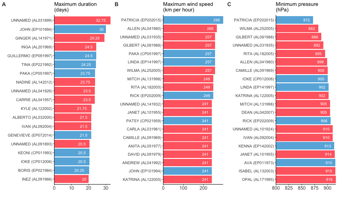
…which are ten put together in a single figure. We can now have a look at the 20 storms that lasted the longest (A), showed the highest maximum wind speed (B), and the lowest minimum pressure (C). (I know that one can argue about cutting the scale here. However, no storm will ever reach 0 hPa, and therefore, I introduced this ‘baseline’.)
plot_grid(plot.dur, plot.wind, plot.pres + remove("x.text"),
          labels = c("A", "B", "C"),
          label_colour = "#3C3C3C",
          ncol = 3, nrow = 1)
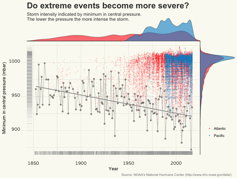
Rankings are a nice way to get an idea about the top of the pops. However, a lot of data is neglected and, hence, one misses a lot of information, too. Here is another way of visualising the storm data: each point represents a measure of minimum pressure (in hPa or mbar).
# Main plot.
plot.pressure.main <- ggplot(data = dd,
                             aes(x = DateTime,
                                 y = Pressure)) +
  geom_point(aes(colour = Ocean),
             alpha = 0.1,
             size = 0.3) +
  geom_point(data = dd.sum.year,
             aes(x = DateTime.p,
                 y = MinPressure),
             shape = 1,
             size = 1.2,
             stroke = 0.5,
             colour = "#333333") +
  geom_line(data = dd.sum.year,
            aes(x = (DateTime.p),
                y = MinPressure),
            size = 0.3,
            alpha = 0.5,
            colour = "#333333") +
  geom_smooth(data = dd.sum.year,
              aes(x = DateTime.p,
                  y = MinPressure),
              method = "lm",
              se = FALSE,
              span = 0.2,
              colour = "#999999",
              alpha = 0.9,
              size = 0.8) +
  theme_bw() +
  geom_rug(alpha = 0.02,
           colour = "#999999") +
  labs(x = "Year",
       y = "Minimum in central pressure (mbar)",
       title = "Do extreme events become more severe?",
       subtitle = expression("Storm intensity indicated by minimum in central pressure. \nThe lower the pressure the more intense the storm."),
       caption = "Source: NOAA's National Hurricane Center (http://www.nhc.noaa.gov/data/)") +
  theme(axis.text = element_text(family = "Varela Round"),
        axis.text.x = element_text(size = 11, colour = "#3C3C3C", face = "bold", vjust = 1),
        axis.text.y = element_text(size = 11, colour = "#3C3C3C", face = "bold", vjust = 0),
        axis.ticks = element_line(colour = "#D7D8D8", size = 0.2),
        axis.ticks.length = unit(5, "mm"),
        axis.line = element_blank(),
        plot.title = element_text(face = "bold", hjust = 0, vjust = -0.5, colour = "#3C3C3C", size = 20),
        plot.subtitle = element_text(hjust = 0, vjust = -5, colour = "#3C3C3C", size = 11),
        plot.caption = element_text(size = 8, hjust = 1.5, vjust = -0.05, colour = "#7F8182"),
        # panel.background = element_rect(fill = "#F1EDE2"),
        panel.background = element_rect(fill = "#FAFAF2"),
        panel.border = element_blank(),
        plot.background = element_rect(fill = "#FAFAF2", colour = "#FAFAF2"),
        panel.grid.major = element_line(colour = "#D7D8D8", size = 0.2),
        panel.grid.minor = element_line(colour = "#D7D8D8", size = 0.2)) +
  theme(legend.title = element_blank(),
        legend.justification=c(0,1),
        legend.position=c(1.02, 0.3),
        legend.background = element_blank(),
        legend.key = element_blank()) +
  scale_colour_manual(values = c("#FF281E", "#0090CF")) +
  guides(colour = guide_legend(override.aes = list(alpha = 1)))

# A density plot on top of the main plot.
# TREAT the date.time AS NUMERIC!!!
plot.pressure.dens.x <- axis_canvas(plot.pressure.main, axis = "x") +
  geom_density(data = dd, aes(x = as.numeric(DateTime), fill = Ocean),
               alpha = 0.6, size = 0.2) +
  scale_fill_manual(values = c("#FF281E", "#0090CF"))
# ...and one on the right site.
plot.pressure.dens.y <- axis_canvas(plot.pressure.main, axis = "y", coord_flip = TRUE) +
  geom_density(data = dd, aes(x = as.numeric(Pressure), fill = Ocean),
               alpha = 0.6, size = 0.2) +
  scale_fill_manual(values = c("#FF281E", "#0090CF")) +
  coord_flip()
Now, one can combine all three plots to a single figure.
plot.pressure.1 <- insert_xaxis_grob(plot.pressure.main,
                                     plot.pressure.dens.x,
                                     grid::unit(0.2, "null"),
                                     position = "top")
plot.pressure.2 <- insert_yaxis_grob(plot.pressure.1,
                                     plot.pressure.dens.y,
                                     grid::unit(.2, "null"),
                                     position = "right")
ggdraw(plot.pressure.2)
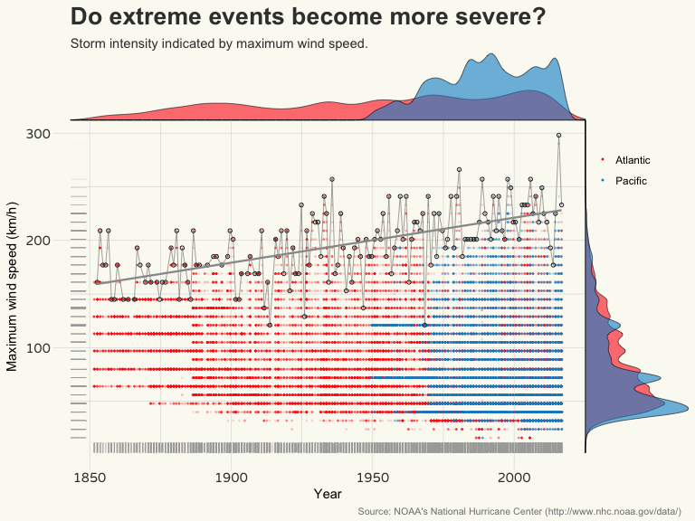
Now, the same figure for wind speed. (I do not show the code since it is almost identical to the one above.)
It seems that minima in central pressure and wind speed maxima are correlated with each other. First, I will check for a linear relationship. There are several ways how to get an idea about a fit and its residuals: either using some ‘automatic’ summary functions outside (e.g. broom package) or within ggplot (geom_smooth). Or, one calculates the residuals by hand. This has the advantage that one can generate a data frame which includes more than just the regression variables.
# Before I forget it: the linear correlation coefficient:
rho.wind.pres <- cor(dd$Pressure, dd$WindKPH, use = "complete.obs")

# A linear regression model of how wind speed is dependent on air pressure.
model.1 <- lm(dd$WindKPH ~ dd$Pressure)
# Generate a data frame for the model fit with 'augment' (broom package)...
dd.model.temp.1 <- augment(model.1)
# ...or by hand from the regression model object. =)
# I include only storms with recorded pressure values.
dd.model.1 <- filter(dd, Pressure != "NA") %>%
  mutate(ModelFitLin = model.1$fitted.values,
         ModelResLin = model.1$residuals)

# And I plot the resudials...
ggplot(data = dd.model.1) +
  geom_point(aes(x = Pressure,
                 y = WindKPH,
                 colour = Ocean),
             alpha = 0.4,
             size = 1.1) +
  scale_colour_manual(values = c("#FF281E", "#0090CF")) +
  geom_line(aes(x = Pressure,
                y = ModelFitLin),
            colour = "#333333") +
  geom_hline(yintercept = 0, size = 0.8, colour = "#3C3C3C") +
  labs(x = "Minimum in central pressure (hPa)",
       y = "Maximum wind speed (km/h)",
       title = "Strong relationship between wind speed and \ncentral pressure",
       subtitle = paste( "Recorded maximum wind speed is correlated with central pressure by", expression(rho), " = ", paste(round(rho.wind.pres, 2)),"."),
       caption = "Source: NOAA's National Hurricane Center (http://www.nhc.noaa.gov/data/)") +
  theme(axis.text = element_text(family = "Varela Round"),
        axis.text.x = element_text(size = 11, colour = "#3C3C3C", face = "bold", vjust = 1),
        axis.text.y = element_text(size = 11, colour = "#3C3C3C", face = "bold", vjust = 0.5),
        axis.ticks = element_line(colour = "#D7D8D8", size = 0.2),
        axis.ticks.length = unit(5, "mm"),
        axis.line = element_blank(),
        plot.title = element_text(face = "bold", hjust = 0, vjust = -0.5, colour = "#3C3C3C", size = 20),
        plot.subtitle = element_text(hjust = 0, vjust = -2, colour = "#3C3C3C", size = 11),
        plot.caption = element_text(size = 8, hjust = 1, vjust = -0.2, colour = "#7F8182"),
        panel.background = element_rect(fill = "#FAFAF2"),
        panel.border = element_blank(),
        plot.background = element_rect(fill = "#FAFAF2", colour = "#FAFAF2"),
        panel.grid.major = element_line(colour = "#D7D8D8", size = 0.2),
        panel.grid.minor = element_line(colour = "#D7D8D8", size = 0.2)) +
  theme(legend.title = element_blank(),
        legend.justification=c(0,1),
        legend.position=c(0.8, 0.97),
        legend.background = element_blank(),
        legend.key = element_blank(),
        legend.text = element_text(size = 10, colour = "#3C3C3C")) +
  # annotate("text", x = 920, y = 310, label = paste("rho = ", round(rho.wind.pres, 2))) +
  guides(colour = guide_legend(override.aes = list(alpha = 1)))
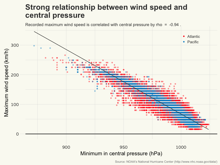
Not bad, but the data seem to show a significant and systematic deviation from the regression model fit (upper left area). I will have a look at the residuals to see whether they confirm my impression that there is heteroskedasticity involved.
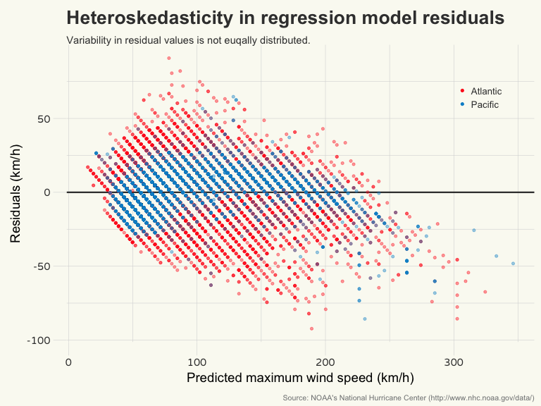
Well, apparently the residuals are not equally distributed, but rather heteroskedastically. That means that a linear relationship does not hold here. For now, I do not want to go into non-linear regression analysis. Therefore, let me simply show how a better relationship between air pressure and wind speed may look like.
ggplot(data = dd,
       aes(x = Pressure,
           y = WindKPH)) +
  geom_point(aes(colour = Ocean),
             alpha = 0.4,
             size = 1.1) +
  scale_colour_manual(values = c("#FF281E", "#0090CF")) +
  geom_smooth(method = "lm",
              formula = y ~ splines::bs(x, 3),
              color = "#333333") +
  geom_hline(yintercept = 0, size = 0.8, colour = "#3C3C3C") +
  labs(x = "Minimum Pressure (hPa)",
       y = "Maximum wind speed (km/h)",
       title = "Strong relationship between wind speed and \ncentral pressure",
       subtitle = paste("A non-linear fit represents this relationship a bit better."),
       caption = "Source: NOAA's National Hurricane Center (http://www.nhc.noaa.gov/data/)") +
  theme(axis.text = element_text(family = "Varela Round"),
        axis.text.x = element_text(size = 11, colour = "#3C3C3C", face = "bold", vjust = 1),
        axis.text.y = element_text(size = 11, colour = "#3C3C3C", face = "bold", vjust = 0.5),
        axis.ticks = element_line(colour = "#D7D8D8", size = 0.2),
        axis.ticks.length = unit(5, "mm"),
        axis.line = element_blank(),
        plot.title = element_text(face = "bold", hjust = 0, vjust = -0.5, colour = "#3C3C3C", size = 20),
        plot.subtitle = element_text(hjust = 0, vjust = -2, colour = "#3C3C3C", size = 11),
        plot.caption = element_text(size = 8, hjust = 1, vjust = -0.2, colour = "#7F8182"),
        panel.background = element_rect(fill = "#FAFAF2"),
        panel.border = element_blank(),
        plot.background = element_rect(fill = "#FAFAF2", colour = "#FAFAF2"),
        panel.grid.major = element_line(colour = "#D7D8D8", size = 0.2),
        panel.grid.minor = element_line(colour = "#D7D8D8", size = 0.2)) +
  theme(legend.title = element_blank(),
        legend.justification=c(0,1),
        legend.position=c(0.8, 0.95),
        legend.background = element_blank(),
        legend.key = element_blank(),
        legend.text = element_text(size = 10, colour = "#3C3C3C")) +
  guides(colour = guide_legend(override.aes = list(alpha = 1)))
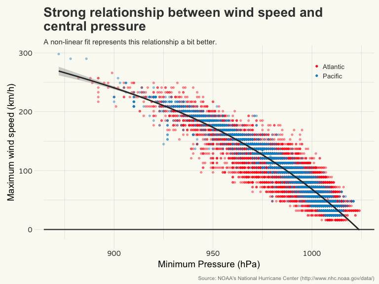
I was using a spline fit that just draws a pretty nice line through the data points. It represents the relationship a bit better. A non-linear fit makes only sense when one has a model at hand that is based on theory and/or part of a hypothesis. That is, one describes the relationship by a model, to then fit it to the data. But since I have no causal explanation why exactly wind speed does not scale linearly with air pressure and how the relationship can be rather explained I just leave it like that… =)
Storing the data set
Again, I save the workspace and skip over to part 2.
save.image("StormDataWorkSpace.RData")