With the synthetic data at hand as described here the next step is the reporting part”. As said before, having an interactive report, i.e., one that enables to sort, filter, and even cross-filter visuals and tables, does not require an overkill tool such as Tableau or PowerBI. Instead it can be generated from code: free of licence costs, versionable, and easy to rebuild whenever the data changes. I believe that for most scenarios this is absolutely sufficient to please stakeholders. Tableau and similar tools are for the very few persons that are considered subject matter experts requiring deep dive possibilities into the data (without being able to code). It is surprising how much already fits into a single, standalone HTML file that can be shared like any other document.
Reporting as a product
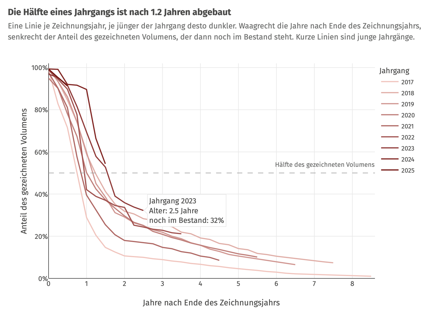
One of the main aspects about such a report: it works as a product that is rebuilt whenever the data changes. Every number in it is computed from the data, and, hence, handled dynamically. For instance, the chart titles are written to say something rather than just label the contents. One of them reads «Die Hälfte eines Jahrgangs ist nach 1.2 Jahren abgebaut», and the 1.2 is not hardcoded, but rather calculated when the report is rendered. A number typed in by hand is wrong as soon as the data changes.
# Figures for the text: half-life per cohort (age at which half has run off)
half_life <- cohort_runoff |>
  filter(share <= 0.5) |>
  summarise(years = min(age), .by = cohort)
median_half_life <- median(half_life$years)
# …
  sprintf("Die Hälfte eines Jahrgangs ist nach %.1f Jahren abgebaut", median_half_life),
The same idea applies to the look of the report. A written style guide records every design rule, from colours to how a title is phrased, and it was kept in step with each decision. Moreover, most of these rules don’t live in a document only, but in one file, _brand.yml (an open format by Posit), that defines the logo, colours, fonts and spacing. Quarto applies it an the HTML report and, at no extra cost, to a PDF version of it, and the Shiny dashboard reads the same file (more on that in the next post). Hence, a change of colour or font is made once and shows up everywhere. And adapting the whole thing to a different corporate design is mostly a matter of editing this file, plus a small palette file for the chart colours.
What the sections show
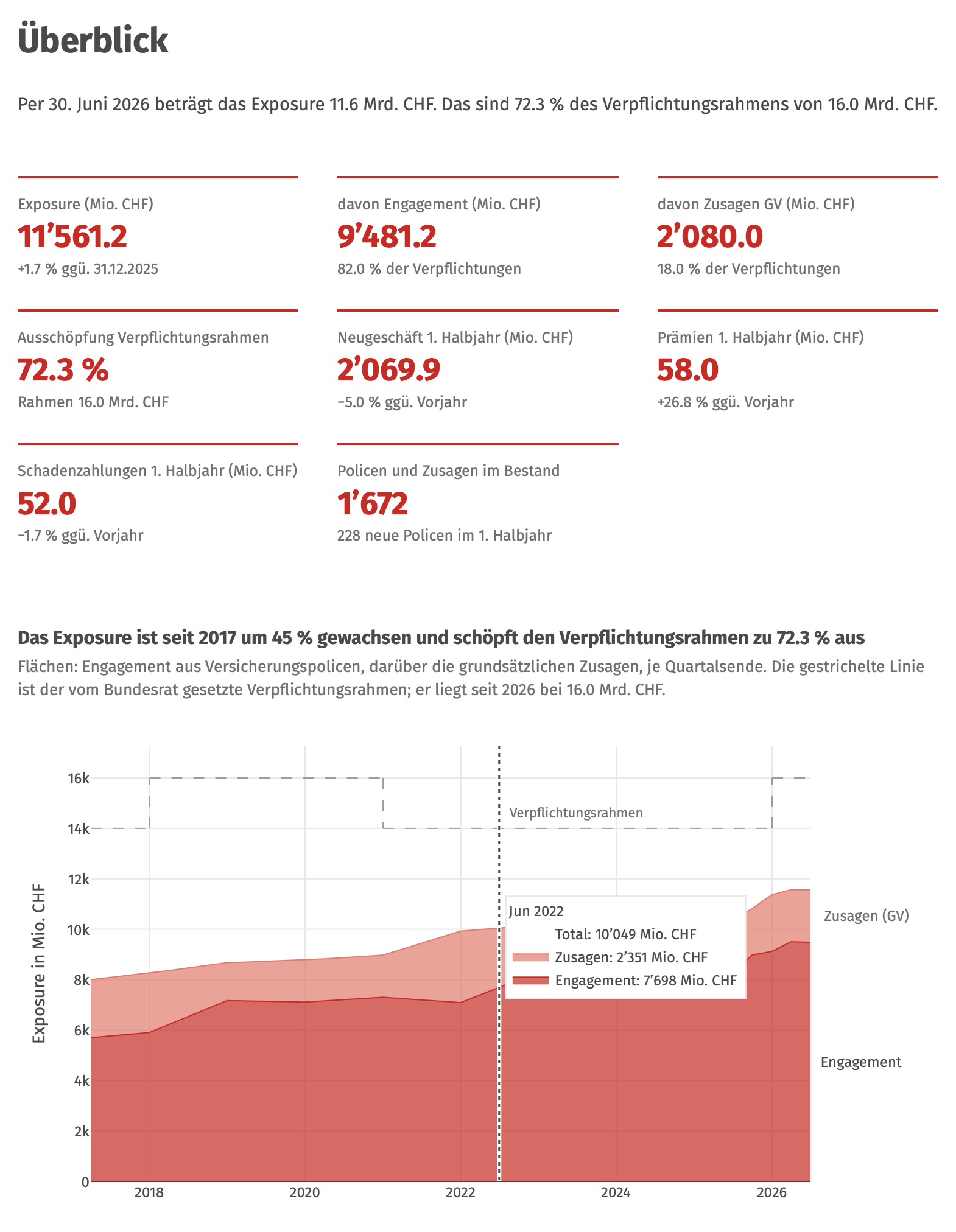
The report has six sections. An overview with the key figures and the exposure since 2017. A result per business year. A country view with a world map, a table and a bubble chart. A treemap of the eight industries that drills down to buyer countries. A cohort view that follows each year’s business as it runs off. And an appendix with the data description and a glossary of every term. It is in German, with a reporting date of 30 June 2026.
The cross-filtering
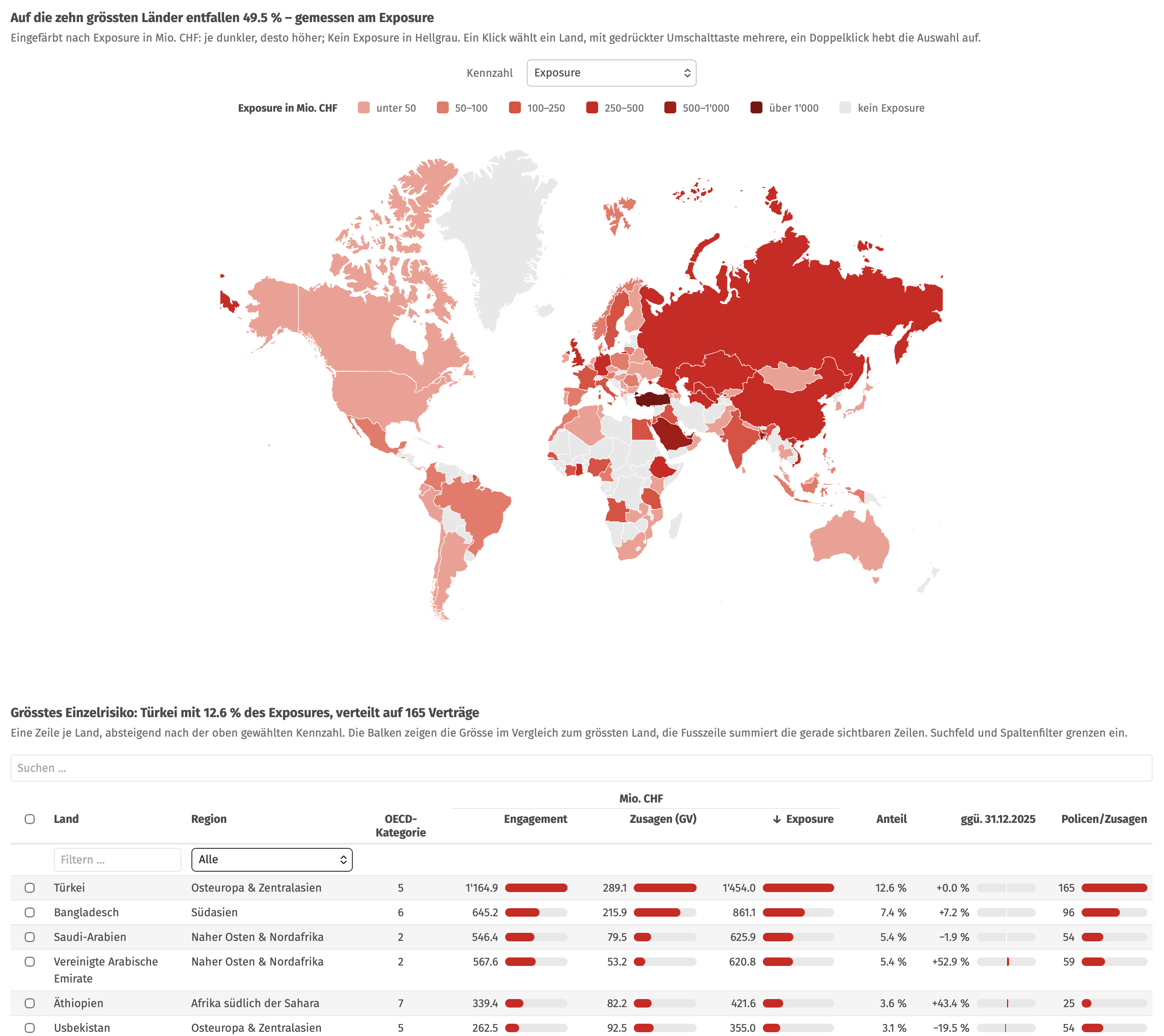
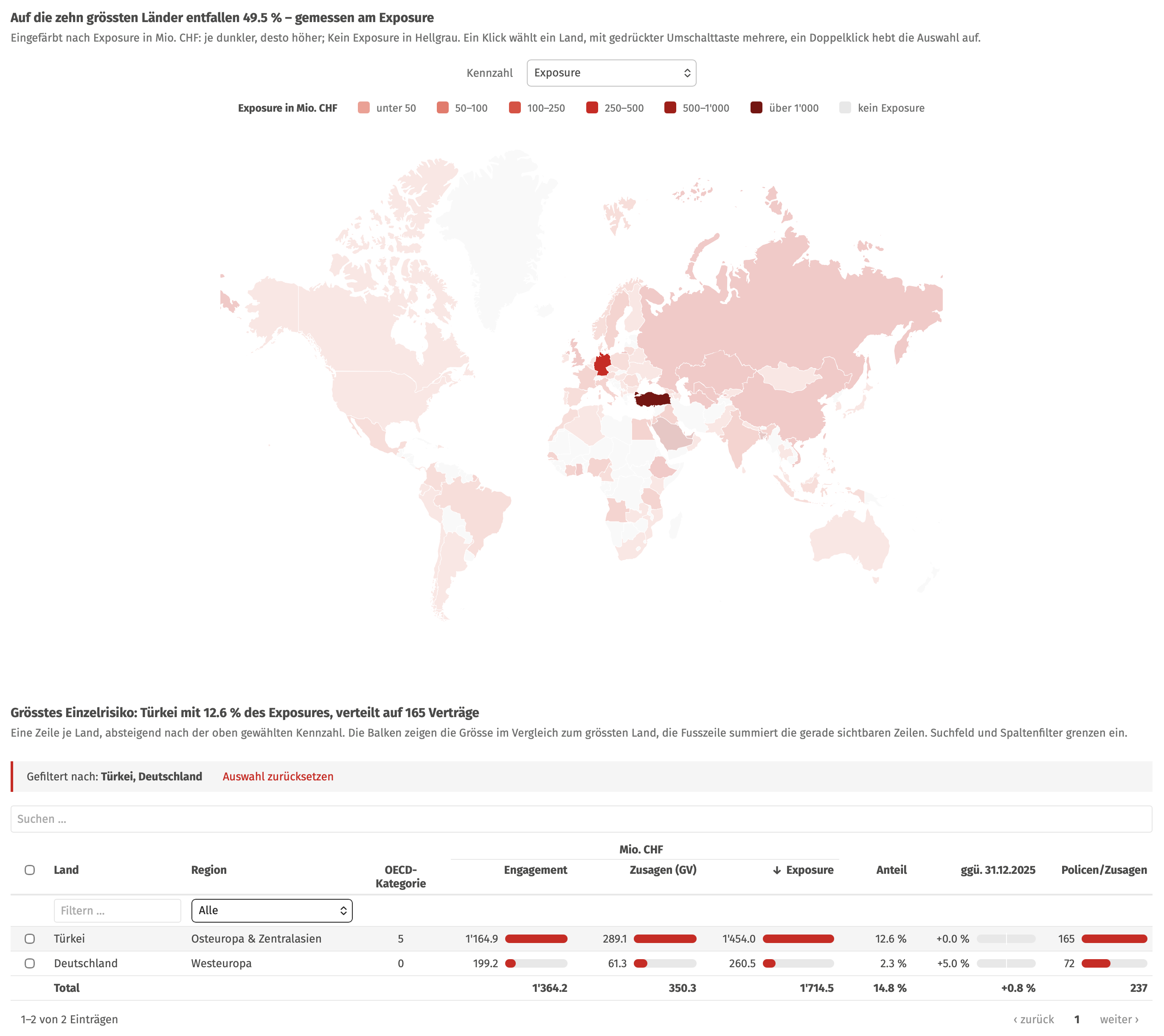
In my opinion, maybe the coolest feature of the report is the cross-filtering in the country view. The world map, the country table, the bubble chart and the treemap all share a single selection. Click a country in any one of them (in the treemap, after opening an industry), and the others follow: the table shows only that country, the map and the bubble chart fade out the rest, and the treemap shows only its business. Shift-click adds further countries, and a double-click clears the selection. Moreover, a single selector decides which figure the whole view is about, from exposure and new commitments to the change since the last year-end or the OECD country risk category. Changing it recolours the map, sorts the table by that figure and redraws the treemap, all at once, and the chart titles change with it.
A single file
Moreover, the whole report is one HTML file of about 7.6 MB, with all scripts, fonts and data embedded in it. Hence, it opens in any browser, also offline, and the reader needs neither a licence nor an account nor any software besides the browser. It can be sent by e-mail or stored on a file share like any other document, and hosting it is just as simple: an intranet page or any internal web server will do, since there is no application running behind it. And because the file is rebuilt from code, a new reporting date simply produces a new file that replaces the old one.
As for security, the file does not connect to any database or source system, and opening it does not load anything from the internet, which also makes it easy to use behind a strict firewall. However, everything shown in the report is contained in the file itself, so it should only hold data one would also be willing to send by e-mail, and access is controlled the same way as for any other confidential document.
How the underlying data was invented and calibrated to SERV’s published figures is in the data post. And when a static report is not enough, because the reader wants to ask the next question themselves, the next post turns all this into a dashboard, and then into an app you can double-click.