A personal data warehouse — free, fast, and local
Posted on March 21, 2026
Many business systems don’t offer a live database connection. They export data periodically — one Parquet file per table, dropped into a folder. That works fine for a one-off look. It becomes a problem the moment you want to join tables, apply consistent transformations, or connect the data to an...
[Read More]
Tags:
DuckDB, dbt, data warehouse, Parquet, SQL, data engineering
Geocoding made easy
Posted on May 4, 2023
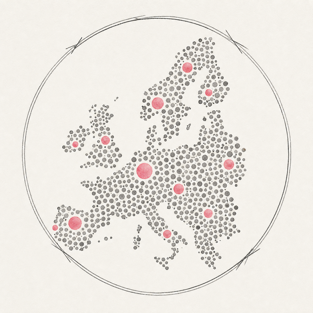
It happens from time to time that I’m using datasets which include physical addresses that need to be turned into longitude/latitude data. For example, when working with data on mass shootings in the US, the Gun Violence Archive GVA provides physical addresses only. So, how to get long/lat data? Well,...
[Read More]
Tags:
R, tidygeocoder, geocoding, geo, map, visualization, viz
PFAS Map
Posted on March 19, 2023
I came across this topic in a recent LinkedIn post by investigative journalist Daniel Drepper. An international research network investigated the spread of PFAS (per- and polyfluoroalkyl substances) to unveil the scale of pollution. This group of chemicals are linked to various deseases such as cancer and infertility. As a...
[Read More]
Tags:
R, Shiny, map, visual analytics, visualization, viz, PFAS, journalism, interactive, exploration
Waffle charts in R
Posted on July 7, 2020
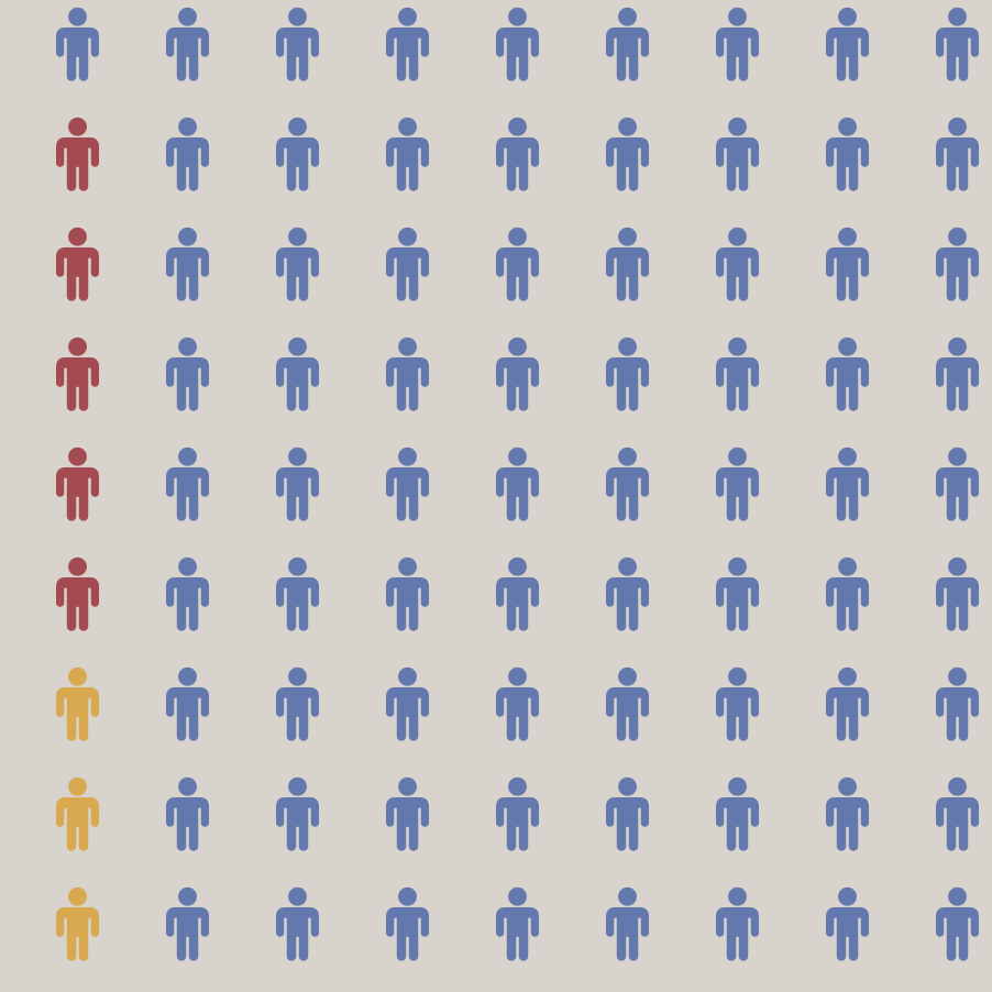
Displaying proportional data, i.e., subsets of data that contribute to a whole, can be done in various ways. However, two particularly suitable types of visualisations are isotypes and waffle charts. By making use of isotypes (international system of typographic picture education), one automatically switches from a continuous representation of data...
[Read More]
Tags:
R, ggplot, visual analytics, visualization, viz, waffle, isotype, chart, CoViD-19
Apple Music Library
Posted on June 30, 2020
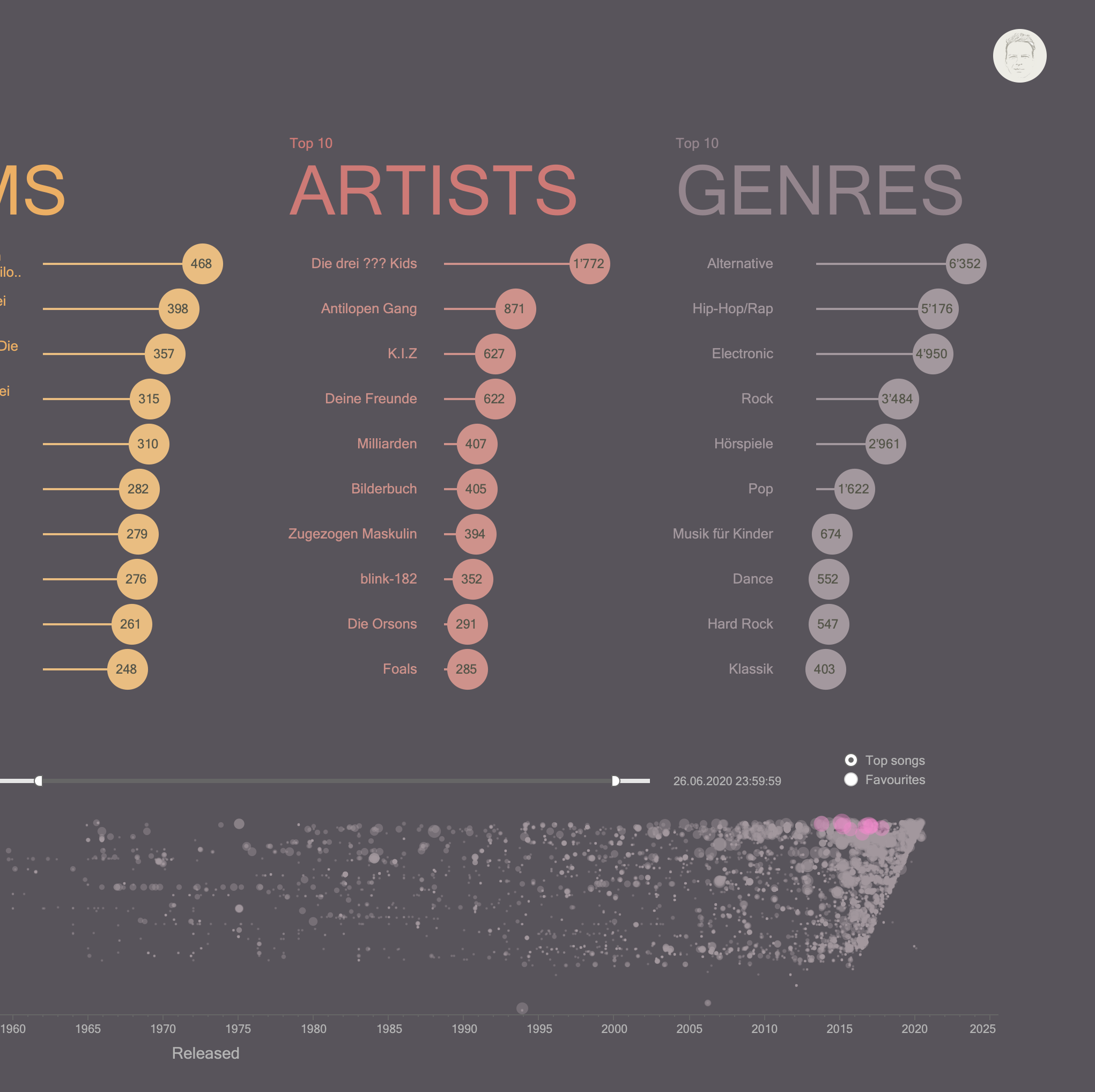
Recently, I was wondering about which are the songs I listen to most often on Apple Music. Sure, Apple Music can show you the “Top 25 Most Played” songs. However, it didn’t provide me with the instant overview I wanted to have. And it’s not made for conditional filtering. So,...
[Read More]
Tags:
Tableau, Tableau Public, dashboard, visual analytics, visualization, viz, Apple, Apple Music, Music